
Build Accessible Carousels That Pass WCAG 2.2 Audits Effortlessly
Build Accessible Carousels That Pass WCAG 2.2 Audits Effortlessly
Build an Accessible Carousel That Meets WCAG 2.2
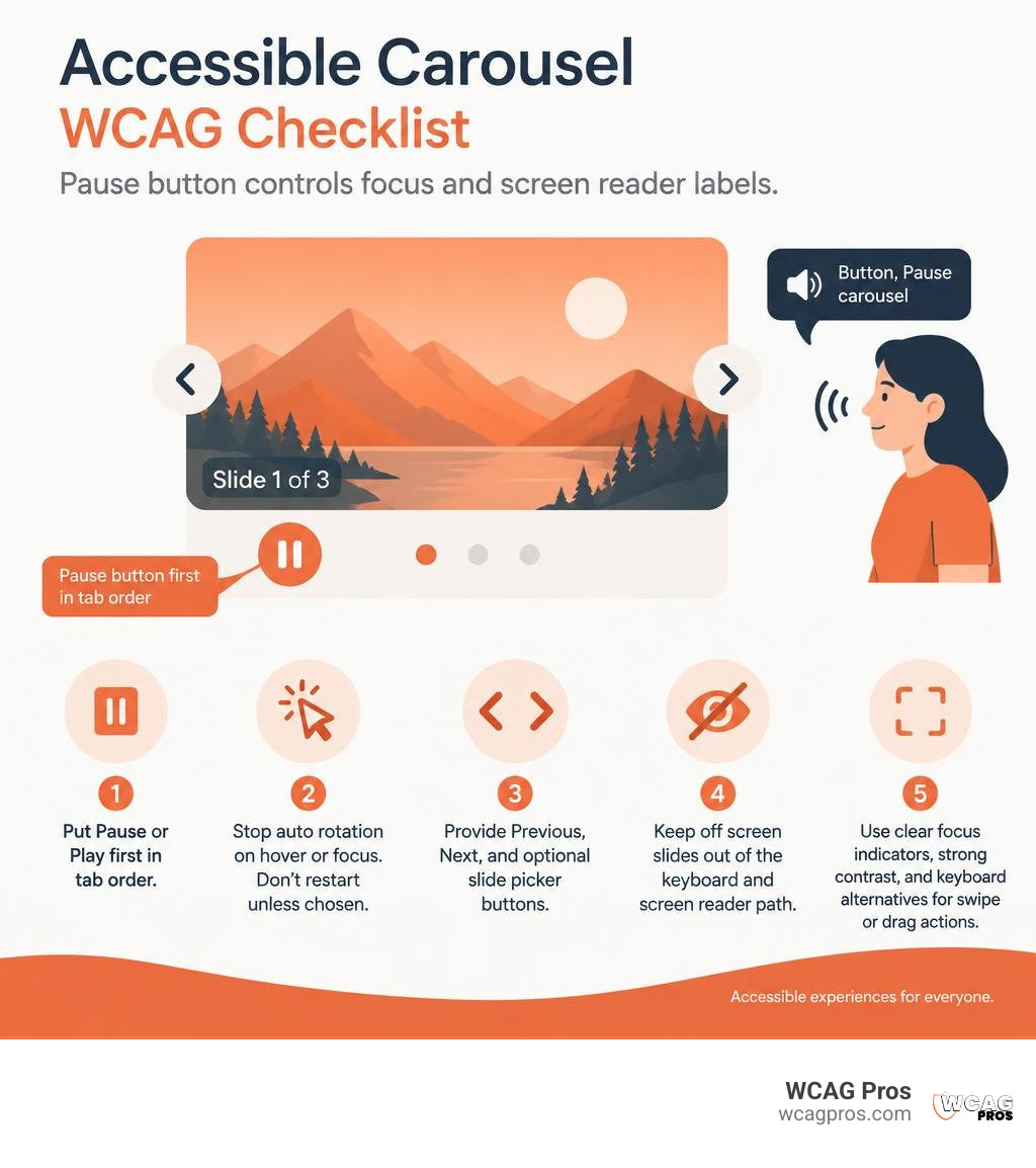
To build an accessible carousel and slider WCAG solution, make every control a real button, keep hidden slides out of the keyboard path, and let users stop any movement. If content advances automatically for more than five seconds, WCAG 2.2 requires a clear pause, stop, or hide option.
Start with these essentials:
- Put a visible Pause or Play control first in the carousel’s tab order.
- Stop auto rotation when users hover over or focus inside the carousel. Do not restart it unless they choose to.
- Provide clearly labeled Previous, Next, and optional slide picker buttons.
- Ensure off screen slides cannot receive keyboard focus or screen reader focus.
- Use clear focus indicators, sufficient control contrast, and keyboard alternatives for swipe or drag actions.
This matters beyond compliance. Moving content can distract people with cognitive disabilities, including people with ADHD. It can also cause keyboard users to lose their place and leave screen reader users unaware that the page changed. A carousel should never make important content harder to find than a standard page section.
I am Matthew Post, co-founder of WCAG Pros and a web developer with more than 20 years of experience auditing and remediating accessibility barriers. I help businesses apply accessible carousel and slider WCAG practices that improve usability and reduce ADA and WCAG compliance risk.
Handy accessible carousel and slider WCAG terms:
Mastering Accessible Carousel and Slider WCAG Standards and Requirements
Carousels remain one of the most frequently failed components during website accessibility audits. A standard slider blends complex DOM manipulation, timer driven animations, dynamic state updates, and custom interactive controls. When these elements operate without strict structural rules, they create serious barriers for keyboard users, screen reader users, and individuals with cognitive differences.
To achieve full WCAG 2.2 Level AA conformance, your implementation must satisfy several fundamental success criteria outlined in the W3C APG carousel design pattern. These criteria govern everything from structure and operation to visual presentation and touch interfaces.
WCAG 2.2 Success Criteria for Sliders and Carousels
Auto-advancing sliders pose major challenges for users with cognitive or visual disabilities. More than 8 percent of adolescents and 4 percent of adults live with Attention-Deficit/Hyperactivity Disorder (ADHD). For these users, unexpected motion can completely derail reading comprehension and focus.
When animations cycle automatically, users reading with screen magnifiers or screen readers can lose their context entirely. If focus sits on a slide that suddenly animates away, the browser may drop focus back to the top of the webpage. This forces the user to navigate the entire document again.
| WCAG 2.2 Success Criterion | Level | Practical Requirement for Carousels | Common Failure Mode |
|---|---|---|---|
| 1.3.1 Info and Relationships | A | Use semantic regions, lists, and headings to structure slides | Using unsemantic div tags with no grouping or role definitions |
| 2.1.1 Keyboard Navigation | A | Make all slide navigation, pause buttons, and cards keyboard accessible | Restricting slide navigation to mouse swipe or pointer drag gestures |
| 2.2.2 Pause, Stop, Hide | A | Provide a toggle button to halt movement lasting over five seconds | Continuous auto-rotation with no user mechanism to stop the animation |
| 2.4.3 Focus Order | A | Maintain sequential tab order and hide inactive slides from focus | Allowing keyboard focus to land on invisible or off-screen slides |
| 2.4.7 Focus Visible | AA | Provide a distinct focus ring with at least 3 to 1 contrast | Stripping default browser outlines using outline: none without replacement |
| 2.4.11 Focus Not Obscured | AA | Ensure sticky banners or overlays do not cover focused slide controls | Fixed headers covering pagination dots during keyboard navigation |
| 2.5.7 Dragging Movements | AA | Provide simple click or tap buttons alongside drag interactions | Requiring horizontal pointer drag gestures to reveal adjacent cards |
| 2.5.8 Target Size (Minimum) | AA | Maintain a minimum touch and pointer target size of 24 by 24 CSS pixels | Tiny 8-pixel pagination dot buttons without adequate hit padding |
| 4.1.2 Name, Role, Value | A | Expose control states, dynamic button labels, and slide counters | Icon-only buttons lacking text labels or aria-label attributes |
Meeting these standards requires careful architectural planning before writing your first line of code.
Architectural Types: Single-Item, Paginated, and Multi-Item Carousels
Not every slider shares the same functional requirements. Selecting the correct architectural pattern directly influences how you manage focus, structure ARIA regions, and announce content updates.
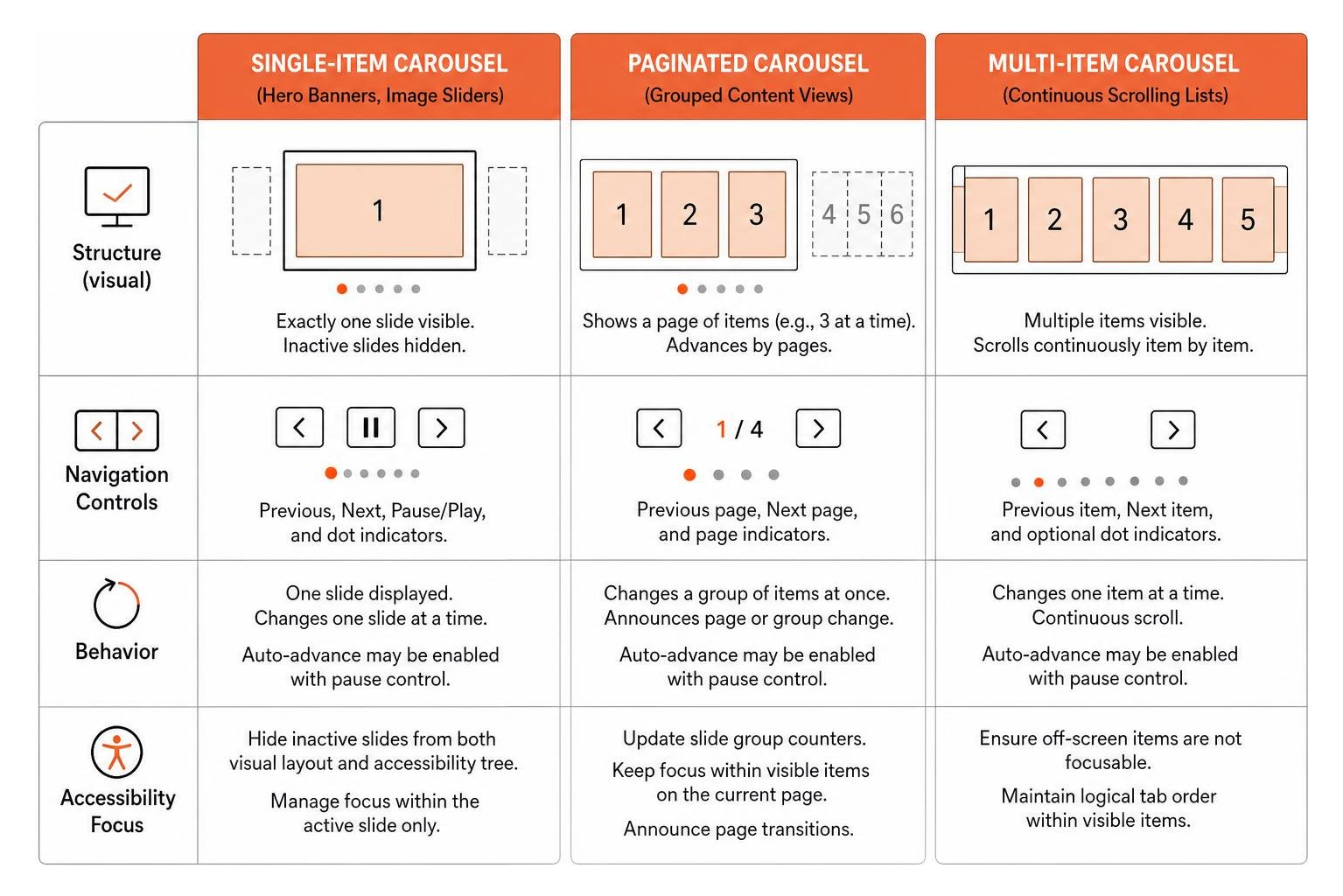
Single-Item Carousels (Hero Banners, Image Sliders) Single-item carousels display exactly one slide at a time within the viewport. They often appear as hero banners on marketing homepages or single-image showcases. Because only one slide remains active at any given moment, every inactive slide must be hidden from both the visual layout and the accessibility tree using CSS properties or the HTML
inertattribute. Single-item carousels typically feature Previous and Next buttons alongside a Pause and Play control.Paginated Carousels (Grouped Content Views) Paginated carousels present distinct pages of content, advancing a fixed set of items simultaneously (for example, displaying three cards on desktop and advancing three new cards upon activation). Instead of announcing individual slide movements, paginated carousels announce the entire page transition or update slide group markers.
Multi-Item Carousels (Product Shelves, Related Articles) Multi-item carousels display continuous tracks of items, often showing several complete cards along with a partially visible trailing item. Because multiple items remain visible simultaneously, all visible cards must remain interactive and accessible in the DOM. For multi-item tracks, standard list semantics using ordered or unordered lists often work best, allowing users to browse through items in natural reading order without unexpected live region interruptions.
Semantic Markup and ARIA Implementation for Sliders

Semantic HTML provides the backbone of an accessible carousel. Custom widgets built entirely from unsemantic div and span elements force screen readers to guess at the interface structure. By using semantic containers, native buttons, and standardized ARIA roles, you provide assistive technologies with a clear mental model of the component.
The parent container of your carousel should use a semantic landmark element, such as a , paired with role="region" and an explicit aria-roledescription="carousel". It must always have an accessible name using aria-label or aria-labelledby that clearly identifies the content without redundantly repeating the word “carousel”.
Designing Accessible Carousel and Slider WCAG Control Buttons
Every control within your carousel must use a native HTML When configuring navigation buttons and slide pickers, keep these practices in mind: Structuring the individual slides correctly ensures screen reader users understand where they are within the collection. Each slide container should feature Managing ARIA live regions requires precision: Proper focus management separates functional carousels from broken ones. When a user navigates using the Tab key, focus must flow logically from navigation controls into the active slide content, without disappearing into off-screen items or getting trapped in circular loops. When slides transition out of view, any focusable elements within them (such as links, form inputs, or buttons) must be removed from the tab sequence. Leaving off-screen elements focusable creates “ghost focus”, where keyboard users press Tab and watch their focus outline disappear into invisible areas of the screen. To prevent ghost focus, apply the HTML If your carousel incorporates auto-rotation, you must give users complete control over the motion. Uncontrolled animations directly violate WCAG 2.2 Success Criterion 2.2.2. To handle auto-rotation properly: Modern web standards introduce powerful CSS features that solve longstanding carousel focus problems declaratively. As detailed in the Chrome for Developers guide on accessible carousels, modern CSS layout properties reduce the need for brittle, JavaScript-heavy focus tracking scripts. Using CSS Scroll Snap ( Furthermore, emerging capabilities in the CSS Overflow Module Level 5 introduce pseudo-elements like This native browser approach guarantees that off-screen slides remain completely un-focusable without writing complex event listeners to toggle attributes manually. Despite widespread documentation, many carousels still rely on outdated development patterns that introduce severe accessibility hurdles. When conducting an accessibility audit of an existing slider, watch out for these widespread mistakes: When building interactive slider controls (such as price filters, volume adjusters, or progress scrubbers), the first question should always be whether to use a native HTML As explained in Jason Webb’s developer guide on how to build a more accessible carousel or slider, native range inputs provide full keyboard support, native touch interactions, and screen reader compatibility right out of the box without extra scripting. If your design requires a custom multi-thumb or non-linear slider that native inputs cannot accommodate, you must construct a fully compliant custom ARIA slider: Building an accessible carousel is only half the battle. Validating its real-world performance through manual and automated testing ensures full compliance. Automated checkers cannot catch every dynamic state flaw or focus timing issue. Conduct thorough manual testing across major browser and screen reader pairings: Integrate automated accessibility linting and scanning into your local development workflow. Automated test suites can scan the DOM to detect missing Running automated audits catches baseline markup regressions before code reaches production environments. An auto-rotating carousel must stop rotation immediately when any element within the container receives keyboard focus or when a mouse cursor hovers over the slider region. Additionally, a visible Pause/Play toggle button must be provided. If a user clicks Pause, rotation must remain stopped permanently until the user clicks Play again. Always use native The ARIA tabs pattern ( Carousels do not have to be an accessibility liability. By adhering to WCAG 2.2 standards, structuring semantic regions, managing keyboard focus cleanly, and giving users total control over animations, you can deliver engaging visual experiences that welcome every visitor. Building and maintaining fully compliant UI components requires continuous attention to detail across evolving browser standards. If you want to evaluate your current components or check your site against legal accessibility requirements, review our curated list of free online accessibility checkers to uncover hidden barriers and begin optimizing your digital experiences today. element. Never use a tag with a click listener to trigger slide changes. Native buttons provide built-in keyboard activation via the Enter and Space keys, expose correct roles to the accessibility tree automatically, and participate naturally in standard tab order.
aria-label dynamically based on state. When the carousel is moving, label the control “Pause slide rotation”. When paused, update the label to “Start slide rotation”. Avoid relying on aria-pressed when changing the visible text label directly communicates the upcoming action. elements with descriptive labels like “Go to slide 1 of 5”. For custom implementations using popular packages, tools like the @accessible360/accessible-slick package help ensure controls retain proper DOM placement and keyboard operability out of the box.Landmark Roles, Slide Descriptions, and ARIA Live Regions
role="group" and aria-roledescription="slide". To provide immediate context on position, assign an accessible name to each slide, such as aria-label="1 of 6". When writing slide names, do not include the word “slide” in the aria-label text itself, because the aria-roledescription already announces that information.
aria-live="off" on the slide track. If an auto-advancing carousel uses aria-live="polite", the screen reader will continuously interrupt the user by reading every new slide title, making the rest of the webpage impossible to consume.aria-live="polite" region can be used to announce slide transitions when the user activates the Next or Previous controls.Focus Management, Auto-Rotation, and Modern CSS Techniques
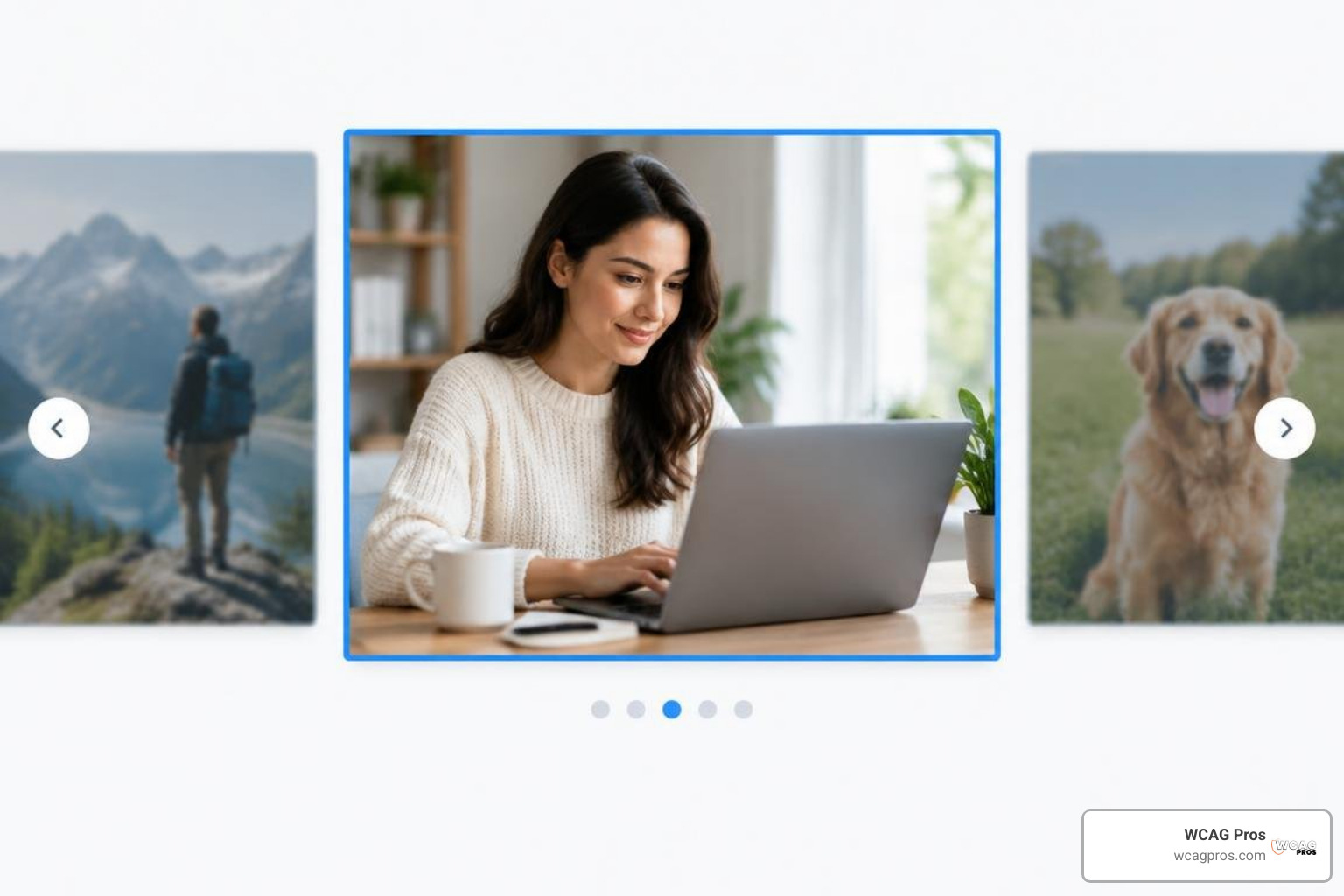
inert attribute or set display: none / visibility: hidden on all inactive slides. The inert attribute tells the browser to ignore the subtree for both user input events and assistive technology inspection.Managing Auto-Rotation and Animation Controls
prefers-reduced-motion media query. If a user has enabled reduced motion settings in their operating system, disable auto-rotation by default and eliminate sliding visual transitions.Eliminating Focus Traps with CSS Scroll-Snap and Interactivity
scroll-snap-type: x mandatory on the container and scroll-snap-align: start on slides), you can create smooth, hardware-accelerated sliding experiences that maintain native keyboard arrow navigation.::scroll-marker and ::scroll-button. When combined with container scroll-state queries and the CSS interactivity property, developers can declaratively set inactive slides to interactivity: inert while granting interactivity: auto strictly to the slide currently snapped into view. Common Anti-Patterns and Implementation Pitfalls to Avoid
Auditing Accessible Carousel and Slider WCAG Anti-Patterns
tablist with role="tab" and role="tabpanel" is often misapplied. The ARIA tabs pattern is designed for static tabbed interfaces where users switch panes while remaining in place. When applied to hero sliders, it strips list semantics, forces complex arrow key requirements, and confuses screen reader navigation modes. Use standard button groups instead.Accessible Slider Inputs: Native Range vs Custom ARIA Controls
.
role="slider" to the draggable thumb element.tabindex="0" so the thumb can receive keyboard focus.aria-valuemin, aria-valuemax, and aria-valuenow.aria-valuetext attribute.How to Test and Audit Carousels for Assistive Technologies
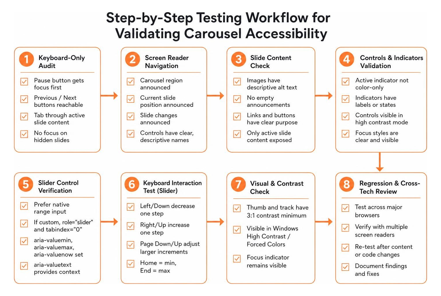
Manual Screen Reader and Keyboard Navigation Testing
Automated Testing and Tooling Solutions
aria-label attributes, inverted aria-valuemin and aria-valuemax boundaries, insufficient color contrast on control icons, and improper nesting of interactive elements.Frequently Asked Questions About Accessible Carousels
How should an auto-rotating carousel stop when a user interacts with it?
When should you use native HTML range inputs instead of custom ARIA sliders?
elements whenever standard single-value linear selections are required. Native inputs provide built-in keyboard navigation, screen reader support, and touch accessibility across all platforms without JavaScript. Only build custom ARIA sliders (role="slider") when you require multi-handle ranges (such as dual price sliders) or non-linear scales that native HTML cannot represent.Why should you avoid using ARIA tabs markup for standard image carousels?
role="tablist", role="tab", role="tabpanel") is designed for static tabbed dialogs where users switch visible panels while staying within the same context. Applying tab markup to rotating image carousels overrides list semantics, imposes unfamiliar arrow-key navigation rules, and creates confusing announcements for screen reader users who expect standard content regions.Conclusion
Read more website accessibility articles
Get Help With Your Website
We'll follow up with info about:
- The process
- Cost
- Timeline
We promise to respect your privacy, and never abuse the information you provide. We will not sell or rent your information to any third party.
By submitting this form, you consent to receive SMS messages and/or emails from SEM Dynamics LLC, dba WCAG Pros. To unsubscribe, follow the instructions provided in our communications. Msg & data rates may apply for SMS. Your information is secure and will not be sold to third parties.