
How to Test Color Contrast Compliance
How to Test Color Contrast Compliance
Why a Contrast Accessibility Test Can Save Your Business from Legal Risk
Running a contrast accessibility test is one of the fastest ways to find out if your website is readable for everyone, including the millions of people with low vision or color blindness.
Here is what you need to know right away:
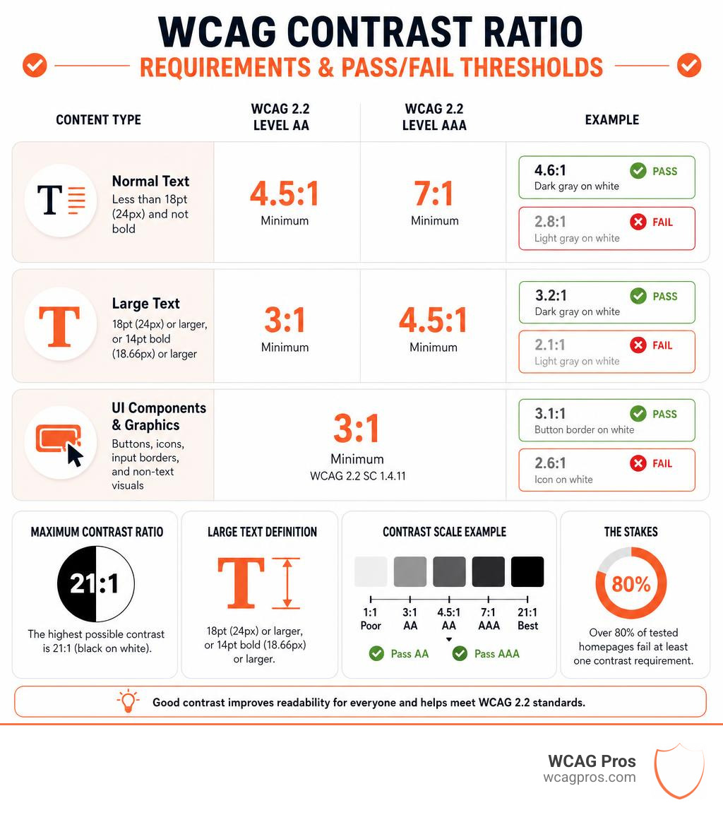
- WCAG 2.2 Level AA requires a minimum contrast ratio of 4.5:1 for normal text and 3:1 for large text
- WCAG 2.2 Level AAA raises those requirements to 7:1 for normal text and 4.5:1 for large text
- UI components and graphics (buttons, icons, input borders) need at least 3:1 under WCAG 2.2 SC 1.4.11
- Large text is defined as 18pt (24px) or larger, or 14pt bold (roughly 18.66px) or larger
- The maximum possible contrast ratio is 21:1, achieved with black text on a white background
- Over 80% of tested homepages fail at least one contrast requirement
The stakes are real. In 2019 alone, 2,256 digital accessibility lawsuits were filed in US federal courts, a 177% increase from 2017. And with 1 in 12 men having some form of color vision deficiency, low contrast is not a rare edge case. It affects a large portion of your users every single day.
I’m Matthew Post, cofounder of WCAG Pros and a web developer with over 20 years of experience auditing sites for WCAG compliance and remediating contrast accessibility test failures across hundreds of commercial websites. In this guide, I will walk you through every step of testing, fixing, and maintaining color contrast so your site stays compliant and your business stays protected.
Basic contrast accessibility test glossary:
Understanding Color Contrast and Web Accessibility
When we talk about color contrast in web design, we are discussing the difference in light and brightness between the foreground text and the background it sits on. This is mathematically defined as relative luminance. It is not just about choosing colors that look nice together. It is about human biology, physical screens, and the diverse environments where people access your digital products.
Many design teams fall into the trap of choosing brand colors that look sleek on a high end monitor in a dimly lit agency office. However, when a user tries to read that same light gray text on a white background while standing in direct sunlight on a mobile device, the text disappears. For users with permanent visual impairments like cataracts, glaucoma, macular degeneration, or various forms of color blindness, the barriers are even higher.
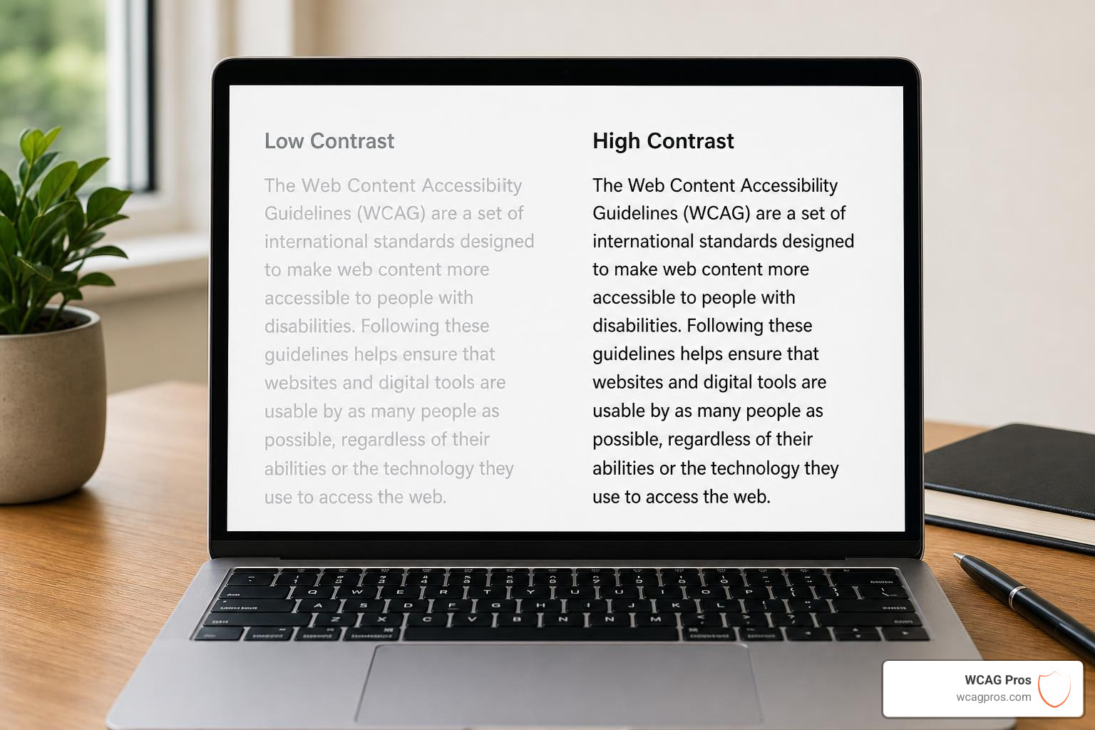
If your website lacks sufficient contrast, you are actively turning away customers. High contrast improves readability for everyone, including tired users, aging populations, and people on low resolution displays. When you prioritize contrast, you make your content pop and keep users engaged. If you are struggling with a brand palette that does not seem to fit the bill, you can read our guide on How to Use a Color Contrast Checker to Save Your Design to learn how to make minor adjustments without losing your visual identity.
WCAG 2.2 Contrast Ratio Requirements
The Web Content Accessibility Guidelines (WCAG) are the global gold standard for digital accessibility. In May 2026, the current active version is WCAG 2.2. This version maintains the exact same contrast ratio formulas as previous versions but applies them to a modern web ecosystem where interactive elements are everywhere.
To help you keep track of these numbers, we have put together a quick reference of the requirements.
- Normal Text: Requires 4.5:1 for WCAG 2.2 Level AA and 7:1 for WCAG 2.2 Level AAA. This applies to text smaller than 18pt (24px) or smaller than 14pt bold (18.66px).
- Large Text: Requires 3:1 for WCAG 2.2 Level AA and 4.5:1 for WCAG 2.2 Level AAA. This applies to text that is 18pt (24px) and larger, or 14pt bold (18.66px) and larger.
- UI Components: Requires 3:1 for WCAG 2.2 Level AA (Level AAA is not applicable). This includes active button borders, input outlines, focus indicators, and key icons.
- Decorative Elements: Exempt from both Level AA and Level AAA. This includes logos, brand names, inactive states, and purely decorative graphics.
Understanding these thresholds is critical for passing any automated or manual audit. For a deeper look at the wider set of rules, you can review The Ultimate Guide to WCAG Guidelines.
Level AA versus Level AAA Compliance
When auditing your digital products, you will target different levels of compliance. Level AA is the standard legal baseline for most international regulations, including the Americans with Disabilities Act (ADA) in the United States. Meeting Level AA ensures that your site is usable for the vast majority of the population.
Level AAA is the highest level of WCAG compliance. It is designed to create an enhanced, highly accessible experience. While Level AAA is rarely mandated across an entire commercial website, it is highly recommended for critical informational pages, public service announcements, and educational portals.
For a complete breakdown of the legal and practical differences, check out our resource on Everything You Need to Know About WCAG 2.2 AA Compliance, which explains how these standards protect your organization and improve usability.
How to Perform a Contrast Accessibility Test
Testing your website for color contrast compliance is a straightforward process when you have the right strategy. We always recommend a hybrid approach that combines automated scanning with manual verification. Automated tools are fantastic for scanning thousands of pages quickly, but manual checks are necessary for catching complex visual states, hover effects, and text placed over dynamic media.

To conduct a thorough contrast accessibility test, follow these essential steps:
- Scan the Entire Site: Use an automated crawler to flag obvious contrast issues across your style sheets.
- Identify Interactive Elements: Locate all buttons, links, form inputs, and custom UI widgets.
- Verify Hover and Focus States: Check that links and buttons remain accessible when a user hovers over them or uses a keyboard to focus on them.
- Inspect Complex Backgrounds: Manually check hero images, video backgrounds, and gradient banners where automated tools often get confused.
- Document and Remediate: Keep a detailed log of failing color pairs and replace them with passing alternatives.
For a detailed walkthrough of testing your actual pages, you can read our guide on Contrast Test Website: Making Your Content Pop for Everyone.
Selecting the Right Contrast Accessibility Test Tool
There are many free and premium tools available to help you check color contrast. You do not need to be a coding genius to use them.
Here are the most popular options for design and development teams:
- Online Contrast Checkers: Simple web based tools where you paste your foreground and background hex codes. Excellent options include the WebAIM Contrast Checker, the PureDevTools Color Contrast Checker, and the LazyTools WCAG Contrast Checker, which even supports batch checking and WCAG 3.0 draft algorithms.
- Other Handy Web Checkers: For quick checks, you can also use the José Manuel Requena Plens Contrast Checker, the DevKitLab Contrast Checker, the Toools.cloud Contrast Checker, the Accessible Web Color Contrast Checker, or the classic Snook.ca Colour Contrast Check.
- Browser Extensions: Extensions like the Accessible Color Picker allow you to grab colors directly from a live web page using an eye dropper tool. This is perfect for checking elements in real time.
- Built in Developer Tools: Google Chrome, Microsoft Edge, and Mozilla Firefox have built in contrast checkers directly in their inspect panels. Simply inspect an element to see its contrast ratio and a pass/fail indicator.
For official documentation and design guidelines, you can also refer to the W3C Web Accessibility Initiative.
Integrating a Contrast Accessibility Test into Your Workflow
The best way to fix contrast issues is to prevent them from ever reaching production. If you wait until a website is fully coded to test its contrast, you will waste valuable engineering hours redesigning layouts and updating stylesheets.
Instead, build contrast testing directly into your design phase. Ensure your design system includes pre approved, high contrast color tokens for text, backgrounds, and borders. Use Figma or Sketch plugins to test your artboards before handing them off to developers.
Finally, add automated contrast checks to your continuous integration and continuous deployment pipelines. This ensures that if a developer accidentally introduces a low contrast color, the build will fail before the code goes live. For more tips on fast fixes, check out our guide on Quick Fixes to Improve Your Website’s Accessibility Today.
Advanced Perceptual Contrast Algorithm vs WCAG 2.2
While WCAG 2.2 is the current legal standard, the accessibility community is actively working on the future of contrast testing. The draft for WCAG 3.0 introduces a brand new model called the Advanced Perceptual Contrast Algorithm (APCA).
The traditional WCAG 2.2 contrast formula is simple and mathematically predictable, but it does not always match how the human eye actually perceives contrast. For example, the current formula treats light text on a dark background the exact same way as dark text on a light background. In reality, our eyes perceive these two scenarios very differently due to screen glow and light scattering.
APCA fixes this by taking several new factors into account:
- Polarity: It recognizes whether you are using light on dark or dark on light text.
- Font Weight and Size: It understands that a thin font needs more contrast to be readable than a thick, bold font.
- Spatial Frequency: It models how our brains perceive fine details and patterns.
Instead of a simple ratio like 4.5:1, APCA produces a signed Lc (Luminance Contrast) value. For body text, APCA recommends an Lc of 60 or higher, while large headings can pass with an Lc of 45. While APCA is not yet a legal requirement, utilizing tools that show both scores will help you future proof your website. For technical details on how the W3C calculates luminance, you can view the W3C Relative Luminance Definition.
Testing Complex Backgrounds and Special States
Testing plain text on a solid white background is simple. However, modern web design is rarely that basic. Designers love using background images, colorful gradients, and semi transparent overlays. Testing these elements requires a bit more care.
When testing text on an image or a gradient, you cannot just test a single background color. You must find the most challenging areas of the background. Identify the lightest point of the image behind your text and test it against your text color. Then, identify the darkest point and test it as well. Your text must pass the contrast check in both locations.
If your text fails on a complex background, you do not have to discard your beautiful imagery. You can apply a semi transparent dark overlay between the image and the text, or add a solid text container box.
Do not forget to test interactive states. Buttons and links change colors when hovered over or focused. These states must also meet the 3:1 or 4.5:1 contrast requirements. This is a common area where otherwise compliant sites fail. For more guidance on managing complex layouts, refer back to The Ultimate Guide to WCAG Guidelines.
Frequently Asked Questions about Color Contrast
We receive many questions from business owners, designers, and developers about how to get their sites up to par. Here are some of the most common queries.
What is the maximum contrast ratio on the color contrast scale?
The maximum possible contrast ratio on the WCAG scale is 21:1. This perfect score is achieved by placing pure black text (#000000) on a pure white background (#FFFFFF). While you do not need to design your entire website in black and white, using this combination for highly technical data, long form articles, and checkout screens is an excellent way to guarantee readability.
How do you calculate the WCAG contrast ratio using relative luminance?
The mathematical formula for calculating a WCAG contrast ratio is relatively simple once you calculate the relative luminance of both colors.
First, you convert the hex color codes to RGB values. Then, you linearize each channel to account for gamma correction. Once you have the relative luminance (L) of both colors, where L1 is the lighter color and L2 is the darker color, you apply the following formula:
Contrast Ratio = (L1 + 0.05) / (L2 + 0.05)
This formula adds a small offset of 0.05 to account for ambient light striking the screen, ensuring that the ratio remains accurate even in real world viewing conditions.
How does color blindness affect contrast testing?
Color blindness, or color vision deficiency, affects roughly 8% of men and 0.5% of women worldwide. The most common forms are deuteranopia (green cone deficiency) and protanopia (red cone deficiency), followed by the rarer tritanopia (blue cone deficiency) and achromatopsia (complete color blindness).
People with color vision deficiency do not see colors the same way as the general population. If you rely solely on color to convey information, such as using red text for errors and green text for success, these users may not notice any difference. By running contrast simulations and ensuring your text contrasts sharply in brightness, you ensure that content remains perfectly legible even if the user cannot distinguish between specific hues.
Conclusion
Running a contrast accessibility test is not just a checkbox on a legal compliance list. It is a fundamental part of building a high quality, professional website that welcomes every user. By understanding the WCAG 2.2 requirements, utilizing the right testing tools, and preparing for future standards like APCA, you can protect your business from legal risks while delivering an outstanding user experience.
If you want to ensure your website is fully compliant without the guesswork, we can help. At WCAG Pros, located in Norco CA, we provide comprehensive ADA website compliance consulting, including detailed WCAG audits, remediation, and certification. Our unique approach features page by page audits of all 54 WCAG A/AAA points with actual code fixes and free re-audits for your compliance badge.
Do not wait for a legal notice to secure your digital presence. Schedule a WCAG Audit with us today and let our team of experts handle the heavy lifting for you.
Read more website accessibility articles
Get Help With Your Website
We'll follow up with info about:
- The process
- Cost
- Timeline
We promise to respect your privacy, and never abuse the information you provide. We will not sell or rent your information to any third party.
By submitting this form, you consent to receive SMS messages and/or emails from SEM Dynamics LLC, dba WCAG Pros. To unsubscribe, follow the instructions provided in our communications. Msg & data rates may apply for SMS. Your information is secure and will not be sold to third parties.