
In Depth Guide to Accessible Responsive Web Design & WCAG 2.2
In Depth Guide to Accessible Responsive Web Design & WCAG 2.2
Why Responsive Web Design Accessibility Matters
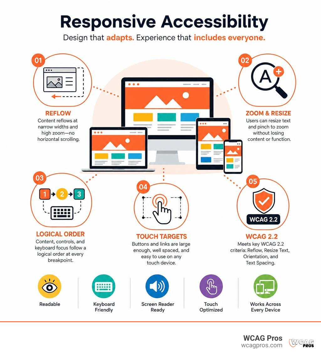
Responsive web design accessibility means building one website that adapts to different screens, zoom levels, orientations, and input methods without blocking people from reading, navigating, or completing tasks.
For a quick answer, accessible responsive design should:
- Reflow content at narrow widths and high zoom without forcing horizontal scrolling
- Let users resize text and pinch to zoom
- Keep content, controls, and keyboard focus in a logical order at every breakpoint
- Provide touch targets, contrast, labels, and navigation that work on phones, tablets, and desktops
- Meet relevant WCAG 2.2 requirements, including Reflow, Resize Text, Orientation, and Text Spacing
A responsive layout is not automatically accessible. A site can look great on a phone while still failing users who navigate by keyboard, use a screen reader, need larger text, or cannot use complex gestures. But when responsive design and accessibility are planned together, they reduce barriers for people with disabilities and create a clearer experience for every visitor.
This matters for business owners, too. Mobile use is now central to the web, and a broken mobile layout can mean lost leads, abandoned forms, frustrated customers, and avoidable ADA risk. WCAG 2.2 gives teams a practical baseline for making content adaptable instead of tying usability to one screen size or device.
I am Matthew Post, co-founder of WCAG Pros and a programmer with more than 20 years of web development experience. I have spent years auditing and remediating sites for responsive web design accessibility, helping organizations find and fix WCAG issues that affect real users and increase compliance risk.
Key responsive web design accessibility vocabulary:
Responsive Web Design Accessibility: Core Concepts and Benefits
When Ethan Marcotte coined the term responsive web design in 2010, the industry focused on adapting layouts to screen resolutions across smartphones, tablets, and desktop computers. Over time, web developers discovered that fluid grids, flexible media, and CSS media queries do far more than support modern phones. They form the foundational layer for universal design on the web.

At its core, responsive web design accessibility recognizes that people interact with websites in countless ways. A visitor might view your site on a wide 4K monitor, a budget smartphone, a portrait orientation tablet, or a desktop screen zoomed in to 400 percent. By pairing dynamic layout principles with inclusive coding, we build digital environments where accessibility and responsiveness work together naturally.
When we approach Responsive Design as Universal Design, we create web pages that cater to diverse physical, sensory, and cognitive needs. Instead of maintaining separate desktop and mobile websites, a unified responsive codebase ensures content parity across devices. Every visitor gets access to the exact same information, interactive forms, and essential utilities.
Our experience in Designing for Everyone with Inclusive Web Design shows that flexible layout structures directly improve digital inclusion. By establishing a logical DOM document object model structure underneath CSS visual styling, we ensure that assistive technologies can interpret page landmarks, headings, and interactive elements correctly regardless of how narrow or wide the display viewport becomes.
How Responsive Web Design Accessibility Supports Assistive Technologies
Modern assistive tools rely on clean, flexible front-end code to render web content effectively. Low vision users often use custom browser magnification or specialized screen magnifiers to zoom into page text. When a site uses responsive techniques, magnifying a page on a desktop display triggers mobile view breakpoints. Content reflows into a neat single column, allowing low vision readers to consume text continuously without panning back and forth across horizontal lines.
Screen readers like VoiceOver, NVDA, and TalkBack also benefit from responsive layouts. When mobile viewports collapse multi-column layouts into a single stream, screen readers can announce page elements in a clear reading sequence. Keyboard navigation becomes far more efficient on streamlined mobile layouts, reducing the total number of tab key presses needed to reach primary navigation items and main content sections.
Supporting text scaling up to 200 percent or higher is a core requirement for accessible design. When typography scales, responsive containers automatically adjust their height and width. This fluid expansion prevents text from overflowing behind adjacent content blocks or getting clipped inside fixed height boxes, keeping every word readable for individuals who require larger font sizes.
Key Differences: Adaptive Design vs. Responsive Web Design Accessibility
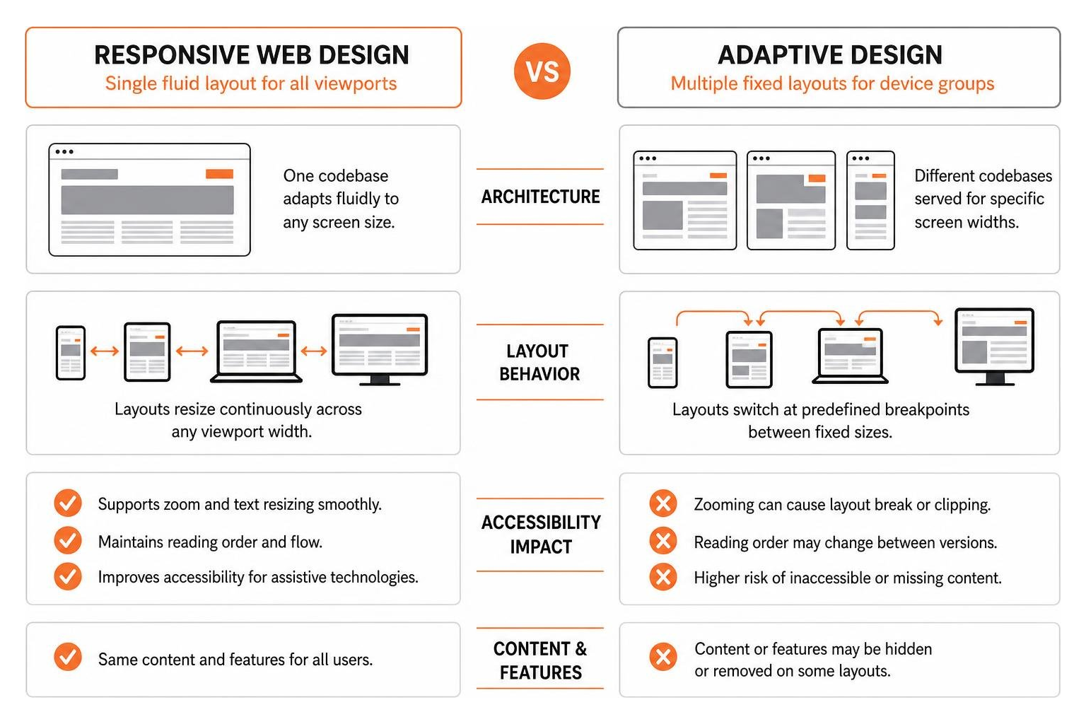
To understand how to build flexible interfaces, we must distinguish between responsive web design and adaptive web design. While both methods serve users on different hardware, their technical architecture and accessibility impacts differ significantly.
Adaptive design uses distinct, fixed pixel layouts crafted for specific target device widths. When a server detects a mobile browser, it delivers a pre-rendered layout built exclusively for that screen width. Responsive design uses a single flexible layout powered by fluid grids, percentage based measurements, and CSS media queries that adjust continuously to any viewport width.
| Feature | Responsive Web Design Accessibility | Adaptive Web Design |
|---|---|---|
| Codebase Architecture | Single fluid codebase adapting dynamically to all viewports | Multiple separate fixed templates served per device group |
| Layout Flexibility | Continuous resizing across every pixel breakpoint | Static steps jumping between predefined screen sizes |
| Content Parity | Guarantees identical content and feature availability | High risk of hidden or stripped out mobile content |
| Zoom & Reflow Support | Natural reflow up to 400% zoom without horizontal scroll | Can break or force multi-directional scrolling when zoomed |
| Accessibility Maintenance | Centralized WCAG compliance updates across all views | Requires testing and remediating separate template versions |
Adaptive design creates accessibility risks because developers often omit complex forms, secondary links, or interactive widgets on mobile templates to save screen space. Content removal creates barriers for disabled individuals who rely on mobile hardware as their primary computing device. Responsive design maintains content parity, ensuring every feature remains accessible at every breakpoint.
WCAG 2.2 Success Criteria for Adaptable and Reflowable Layouts
The Web Content Accessibility Guidelines version 2.2, created by the W3C, set the technical baseline for digital accessibility worldwide. WCAG 2.2 is organized around four core principles, known as POUR: Perceivable, Operable, Understandable, and Robust.
Meeting WCAG 2.2 Level AA guidelines ensures your web property complies with major international laws, including Title III of the Americans with Disabilities Act in the United States and the European Accessibility Act. Several specific WCAG 2.2 success criteria focus directly on responsive layouts and text adaptability.
Understanding how browser controls interact with page layouts is essential when applying guidelines for Zoom and Reflow. Designing for WCAG 2.2 compliance transforms responsive design from an optional aesthetic approach into a required accessibility standard.
Success Criterion 1.4.10: Reflow and Single-Column Scrolling
WCAG 2.2 Success Criterion 1.4.10 Reflow requires web content to adapt seamlessly to small viewports without losing information or requiring multi-directional scrolling. Specifically, content written in left-to-right or right-to-left languages must reflow into a single column at a width equivalent to 320 CSS pixels without forcing horizontal scrollbars.
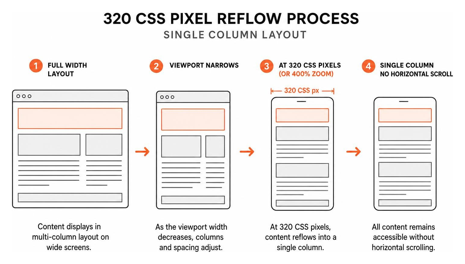
A viewport width of 320 CSS pixels corresponds directly to viewing a standard web page on a modern smartphone in portrait orientation. It also corresponds to zooming a desktop browser window to 400 percent magnification at a standard desktop display width of 1280 CSS pixels.
When a user with low vision zooms in to 400 percent, single-column reflow eliminates horizontal scrolling. Forcing someone to scroll horizontally back and forth to read a single line of text severely degrades reading speed and comprehension. Multi-directional scrolling also creates friction for people with physical or motor disabilities who use switch access devices or specialized trackballs.
Exemptions to SC 1.4.10 exist only for complex content layouts where two-dimensional spatial presentation is strictly necessary for usage or meaning. Examples of exempt content include interactive geographic maps, video editing interfaces, virtual canvas tools, and multi-column data tables.
Success Criterion 1.4.4: Resize Text and Scalable Typography
WCAG 2.2 Success Criterion 1.4.4 Resize Text mandates that page text can be scaled up to 200 percent without using specialized screen magnifiers or assistive tools, and without losing page content or functionality.
To satisfy this rule responsively, developers must build layouts using scalable relative units rather than static, fixed pixel measurements. Defining font sizes, container margins, and component heights in relative units like em or rem units allows text to enlarge smoothly while surrounding layout boxes expand dynamically.
When layouts rely on rigid pixel heights, zooming text causes container overflow issues. Text can overlap adjacent paragraphs, become truncated behind container edges, or spill out across navigation menus. Using relative typography units paired with flexible min-height CSS rules prevents text clipping and ensures readable layouts at high magnification settings.
Success Criterion 1.3.4 & 1.4.12: Orientation and Custom Text Spacing
Two additional WCAG 2.2 success criteria protect layout adaptability across device display states and custom user style preferences.
Success Criterion 1.3.4 Orientation dictates that web content must not restrict its view or operation to a single display orientation, such as locking a site strictly to portrait mode or landscape mode. Users mounting mobile devices to wheelchairs or motorized scooters often cannot rotate their screens physically. Unless a specific orientation is strictly essential, such as playing a virtual piano app or scanning a physical check, your layout must operate seamlessly in both portrait and landscape views.
Success Criterion 1.4.12 Text Spacing requires that no loss of content or functionality occurs when users apply custom CSS spacing overrides. Layouts must withstand custom style adjustments up to:
- Line height spacing equal to at least 1.5 times the font size
- Paragraph spacing following paragraphs equal to at least 2 times the font size
- Letter spacing tracking equal to at least 0.12 times the font size
- Word spacing equal to at least 0.16 times the font size
Custom text spacing helps readers with visual impairments, dyslexia, and cognitive processing differences read content easily. Responsive layouts must maintain component flexibility so custom text expansion does not break container boundaries or cause overlapping text boxes.
Key Technical Principles and Design Strategies
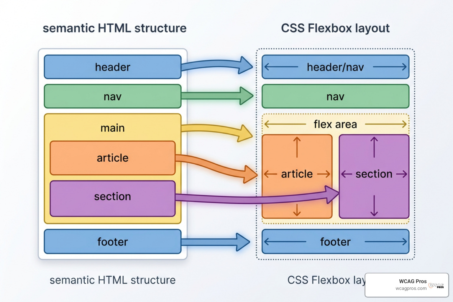
Building accessible responsive interfaces requires pairing core front-end concepts with modern layout techniques. Developers can build highly flexible components using HTML structural semantics, modern CSS flexbox, and grid modules.
A comprehensive guide on How to Build Responsive and Accessible UI Designs with React and Semantic HTML highlights how modern JavaScript frameworks can implement clean layout patterns while preserving full screen reader compatibility.
Combining three fundamental web design principles supports flexible accessibility:
- Fluid grid systems using percentage widths to scale page elements dynamically
- Fluid images and flexible media that scale inside parent layout containers
- CSS media queries that adjust visual presentation based on display dimensions and user system preferences
To enhance responsive layouts effectively, we recommend using progressive enhancement and progressive disclosure. Progressive enhancement builds a functional core experience with clean HTML first, then layers on advanced layout styles and JavaScript interactions for modern hardware. Progressive disclosure hides non-essential secondary details inside interactive elements like accordions, reducing screen clutter on mobile viewports.
Semantic HTML, DOM Order, and Focus Management
The foundation of accessible responsive web design rests on using proper semantic HTML elements. Native elements like header, nav, main, article, section, and footer establish structural landmark regions that screen reader users rely on to skip through long pages quickly.
When building responsive designs, maintain a logical document object model source order that matches visual presentation. CSS tools like Flexbox and CSS Grid allow developers to reorder page elements visually using CSS order properties or grid area placements. Reordering elements visually without updating underlying HTML code creates a mismatch between visual layout and keyboard focus order.
For instance, if CSS flexbox flips the visual layout of a form so that submit buttons appear visually before input fields, a sighted keyboard user tabbing through the page will jump around unexpectedly. Keyboard focus must move sequentially through interactive elements in a logical reading order across desktop, tablet, and mobile views.
When building dynamic responsive navigation menus, such as mobile hamburger menus, programmatic state management is essential. Toggle buttons must use clear aria-expanded attributes set to true or false so screen reader users know when hidden drawer panels are open or collapsed.
Touch Targets, Viewport Settings, and Responsive Typography
Mobile and touchscreen devices require careful attention to physical target sizing and screen scaling settings. When users interact with screens using fingers or thumbs, small links and tightly packed buttons cause input errors, frustrating individuals with motor tremors or hand fatigue.
WCAG 2.2 Success Criterion 2.5.8 Target Size Level AA establishes a minimum touch target size of 24 by 24 CSS pixels, while Level AAA guidance recommends targets measuring at least 44 by 44 CSS pixels. Adding adequate white space around clickable controls prevents accidental taps on adjacent links.
To support viewport adaptability correctly, every HTML page header must contain a proper meta viewport tag. The standard syntax for accessible responsiveness is:
Never restrict user scaling by inserting user-scalable=no or setting maximum-scale=1. Disabling pinch-to-zoom creates a severe barrier for mobile visitors with low vision who need to zoom in on mobile devices.
For responsive typography, consider using modern CSS clamp syntax. CSS clamp sets a fluid font scaling range that transitions smoothly between a minimum font size, a flexible viewport percentage unit, and a maximum font size:
font-size: clamp(1rem, 2.5vw, 1.5rem)
Fluid typography eliminates abrupt font size jumps at media query breakpoints, offering readable text across any device width.
Common Pitfalls and Best Practices for Multi-Device Usability
Despite best intentions, development teams frequently introduce accessibility barriers when building responsive layouts. Catching these mistakes early in the design phase saves time and prevents costly remediation cycles later.
Reviewing practical guides like Accessible responsive design | web.dev offers valuable technical insight into preventing layout failures across screen sizes.
Avoid these common multi-device mistakes:
- Removing essential interactive features or text content on smaller mobile views
- Disabling mobile viewport zoom controls inside the meta viewport header tag
- Using fixed pixel widths on layout containers, wide images, or form inputs
- Using HTML tables for visual page layouts instead of tabular data displays
- Hiding content visually using display:none without removing it from screen reader trees properly
- Creating keyboard focus traps inside mobile drawer navigation menus
- Relying on spatial instructions like click the button on the left that break on stacked mobile layouts
Avoiding Viewport Restrictions and Non-Fluid Formatting
The most damaging responsive accessibility failure is restricting user zoom capabilities inside the viewport meta tag. Setting user-scalable=no or constraining maximum-scale to 1.0 breaks mobile usability completely for low vision readers. Always ensure your viewport configurations allow pinch-to-zoom magnification up to at least 200 percent on mobile hardware.
Non-fluid layout formatting creates another major barrier. When developers assign static pixel widths to layout containers, embedded videos, or form inputs, content overflows past mobile screen boundaries. This forces users into multi-directional scrolling, violating WCAG 2.2 Reflow requirements.
Layout tables present severe challenges on mobile displays. Tables are not inherently fluid and do not reflow cleanly into single columns on small screens. Restrict table tags strictly to structured tabular data, wrapping them inside scrollable containers with role=”region”, descriptive aria-labels, and tabindex=”0″ so keyboard users can scroll through table rows comfortably.
For general layout structures, use flexible column components built with Flexbox or CSS Grid instead of hardcoded table markup.
Content Prioritization and Progressive Disclosure
Mobile viewports offer limited physical screen space. However, managing small screens by deleting lower page sections creates content parity issues and leaves mobile users without complete information.
Instead of deleting content, apply content prioritization paired with progressive disclosure. Position critical summary information, primary call to action controls, and core form fields near the top of the mobile page layout. Secondary content, detailed FAQs, or long technical lists can be organized into interactive accordion components or collapsible navigation drawers.
Accordions allow users to scan page headers quickly while keeping secondary content available on demand. When implementing progressive disclosure UI patterns, use native button triggers with explicit aria-expanded and aria-controls attributes. This ensures screen readers announce expanded states correctly while keeping mobile page heights manageable for touch scrolling.
How to Test Responsive Websites for Accessibility Compliance
Ensuring full accessibility across multi-device environments requires combining automated testing scans with thorough manual evaluations. While automated tools spot missing alt tags and contrast issues rapidly, human testing remains necessary to verify logical focus navigation and reflow behavior.
Comprehensive resources like The Ultimate Guide to Online Accessibility Testing and our Practical Accessibility Testing Guide 2026 outline practical methodologies for auditing complex responsive sites.
Manual Viewport and Zoom Testing
Manual testing should begin directly inside desktop browsers like Chrome, Firefox, or Safari. Developers can test zoom and reflow behavior without requiring physical hardware:
- Open your page in a desktop browser and set the browser viewport display width to 1280 CSS pixels.
- Use browser zoom controls to enlarge the web page to 200 percent magnification, checking for text clipping, container overlaps, or truncated layout boxes.
- Increase browser zoom magnification to 400 percent, verifying that content reflows into a single vertical column without generating horizontal scrollbars.
- Reduce browser viewport width down to 320 CSS pixels, confirming that all page features and form inputs remain fully visible and operable.
- Unplug your mouse and use the Tab, Shift+Tab, Enter, and Space keys to navigate through the entire page at every major breakpoint, ensuring keyboard focus indicators remain clearly visible and move in a logical order.
Automated Tools and Real-User Testing Across Devices
Automated accessibility tools simplify initial page audits. Running browser extensions like the ARC Toolkit, axe DevTools, or Google Lighthouse helps identify broken meta viewport tags, low color contrast ratios, and unlabelled interactive controls.
However, automated scanners cannot determine whether a mobile menu interaction feels intuitive or if a screen reader reading order makes sense visual layout shifts occur.
Testing with real users and physical mobile hardware is essential. Conduct manual testing using native mobile screen readers, such as Apple VoiceOver on iOS devices and Google TalkBack on Android smartphones. Swipe through layout components, open dynamic navigation menus, and submit forms using screen reader touch gestures to verify seamless operation.
For structured guidance on setting up evaluation sessions, review our guide on How to Test Your Website’s Accessibility Using Real Users.
Frequently Asked Questions About Responsive Accessibility
Does WCAG 2.2 explicitly require responsive design?
Yes, WCAG 2.2 explicitly requires responsive design principles under Success Criterion 1.4.10 Reflow. SC 1.4.10 mandates that web content reflows without loss of information or functionality and without requiring horizontal scrolling at a width equivalent to 320 CSS pixels.
While the guideline text does not mention the term responsive design explicitly, using fluid grids, media queries, and responsive front-end techniques is the primary technical method to meet this requirement.
What is the most common responsive design accessibility mistake?
The single most common responsive design accessibility mistake is disabling browser zoom on mobile viewports by adding user-scalable=no or setting maximum-scale=1 within the HTML meta viewport header tag.
This meta tag configuration prevents users with low vision from using pinch-to-zoom screen magnification on smartphones, blocking them from reading smaller text entirely.
How does responsive web design improve SEO and site performance?
Responsive web design impacts search engine optimization directly because search engines evaluate pages using mobile-first indexing. Having one responsive site ensures full content parity between mobile and desktop views, preventing indexing gaps.
Responsive layouts also help satisfy Core Web Vitals targets, such as Interaction to Next Paint (INP) and Cumulative Layout Shift (CLS), reducing page bounce rates and supporting overall organic search visibility.
Conclusion: Building Universal Digital Experiences
Responsive web design accessibility is more than an technical implementation detail or a legal compliance checklist item. It represents a fundamental commitment to universal design, ensuring digital spaces welcome every visitor regardless of their device, screen size, zoom preferences, or physical abilities.
By designing flexible grids, prioritizing semantic HTML structure, maintaining clean document order, supporting high browser magnification, and eliminating viewport scaling restrictions, we build web properties that perform well for everyone.
At WCAG Pros, we help organizations turn digital accessibility into a seamless part of their web development workflow. Our team provides comprehensive page-by-page audits across all 54 WCAG Level A through AAA criteria, offering clear code remediation guidance and free re-audits to help you earn compliance badges with confidence.
If you are ready to evaluate your website’s responsive accessibility or need help remediating digital barriers, explore our page to Get Expert Website Accessibility Services today.
Read more website accessibility articles
Get Help With Your Website
We'll follow up with info about:
- The process
- Cost
- Timeline
We promise to respect your privacy, and never abuse the information you provide. We will not sell or rent your information to any third party.
By submitting this form, you consent to receive SMS messages and/or emails from SEM Dynamics LLC, dba WCAG Pros. To unsubscribe, follow the instructions provided in our communications. Msg & data rates may apply for SMS. Your information is secure and will not be sold to third parties.