
10 Practical Digital Accessibility Examples You Need to Try Today
10 Practical Digital Accessibility Examples You Need to Try Today
The State of Digital Accessibility: Why Examples Matter Right Now
Digital accessibility examples give you a concrete starting point for making your website usable by everyone, including people with visual, auditory, motor, and cognitive disabilities. Here are 10 of the most practical ones:
- Descriptive alt text on images so screen readers can describe visuals
- Keyboard navigation with visible focus indicators for users who cannot use a mouse
- High color contrast ratios (minimum 4.5:1 for normal text) for low vision users
- Accessible form labels and error messages that guide users through inputs
- Closed captions and audio transcripts for all video and audio content
- Semantic HTML and logical heading hierarchies so screen readers can navigate structure
- Camel Case hashtags on social media so screen readers read each word correctly
- Accessible task timelines instead of loading spinners for long processes
- Scalable text and custom font settings for low vision and dyslexic users
- Skip to main content links so keyboard users can bypass repetitive navigation
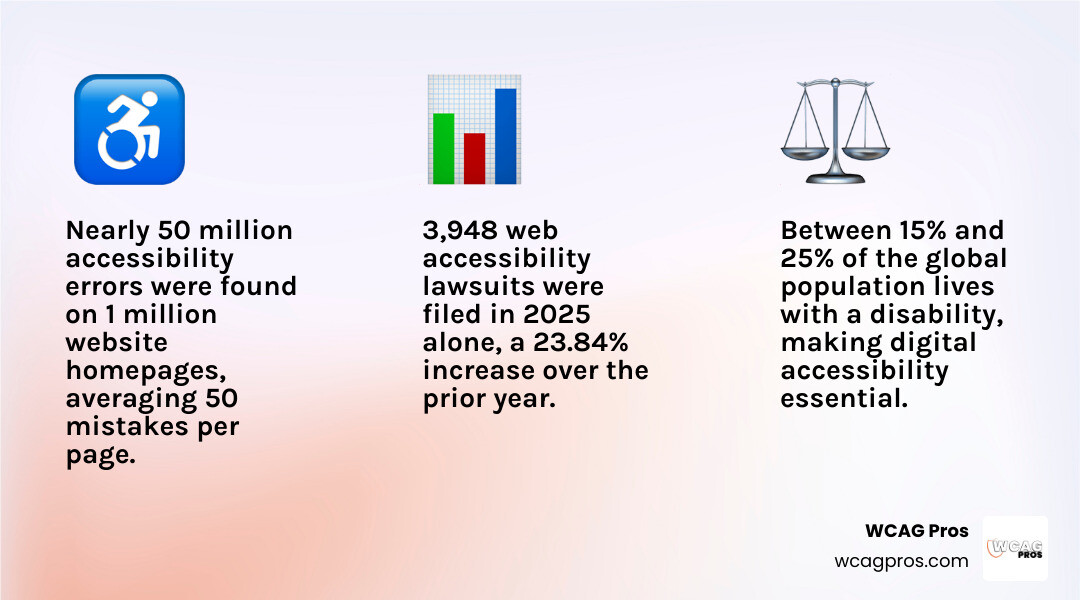
The numbers behind the problem are hard to ignore. Analysis of one million website homepages detected nearly 50 million accessibility errors, averaging 50 mistakes on every single page. That means most websites are actively blocking a significant portion of their visitors. Between 15% and 25% of the global population lives with a disability, and 3,948 web accessibility lawsuits were filed in 2025 alone, a 23.84% increase over the prior year.
Many of these failures are not complex coding problems. A significant share of web accessibility barriers come from simple content level omissions: missing alt text, vague link text, wrong heading tags, poor color contrast. The fixes are often straightforward once you know what to look for.
I’m Matthew Post, cofounder of WCAG Pros and a web developer with over 20 years of experience auditing sites for digital accessibility examples and WCAG compliance. I personally oversee every audit and remediation project we take on, so the guidance in this article comes from real world fixes, not theory.
Digital accessibility examples terms made easy:
Understanding the Core Principles of Digital Accessibility Examples
To understand why these examples matter, we must look at the foundation of digital accessibility. The web is meant to be universal. Access by everyone is a basic human right. This is even recognized by the United Nations Convention on the Rights of Persons with Disabilities. When we build digital spaces, we use the Web Content Accessibility Guidelines, which are known as WCAG 2.2. These guidelines are organized under four core principles. You can remember them with the acronym POUR.
- Perceivable: Users must be able to see or hear the information. It cannot be invisible to all their senses.
- Operable: Users must be able to navigate the interface. It cannot require interactions that a user cannot perform, like requiring a mouse when someone can only use a keyboard.
- Understandable: Users must be able to comprehend the content and how to use the interface.
- Robust: The content must remain accessible as technology evolves, meaning it works well with assistive technologies like screen readers.
These principles are not just good ideas. They are backed by strict legal frameworks. In the United States, the Americans with Disabilities Act, or ADA, requires businesses to make their websites accessible. Section 508 of the Rehabilitation Act mandates compliance for federal agencies and organizations receiving federal funding.
If you are operating in California, you are also bound by state specific rules. The state has its own Accessibility guidelines to ensure all users have equal access. Local municipalities also push for higher standards, such as the Digital Accessibility and Inclusion Standard which outlines clear expectations for digital content.
To help your business meet these high bars, we recommend reviewing The Complete Guide to WCAG AA Compliance Requirements. Meeting these requirements protects your business from legal risks while expanding your market reach to the 15% of the population living with a disability.
10 Practical Digital Accessibility Examples
Let us dive into concrete, actionable digital accessibility examples that you can implement on your website today. These examples show how inclusive design improves the user experience for everyone.
Descriptive Alternative Text as Essential Digital Accessibility Examples
Alternative text, or alt text, is a short description written into the HTML code of an image. When a screen reader encounters an image, it reads this text aloud to visually impaired users. If an image fails to load, the alt text displays on the screen in its place.
There is a difference between simple alt text and an image description. Alt text provides the most essential details of the visual, while an image description provides deeper context. For example, if you have an image of a spilled drink, your alt text might say “spilled orange juice on the floor” while the image description might detail the specific shape of the puddle and the surrounding room.
When writing alt text, you should avoid starting with “image of” or “picture of” because the screen reader already announces that it is an image. If an image is purely decorative, like a background swirl, you should use an empty alt attribute so screen readers know to skip it.
A great example of this in action is documented in the Sima Darvish Portfolio: Case Study #1. During an ecommerce audit, mapping all imagery to proper alt text logic helped users with visual impairments navigate product catalogs seamlessly.
Keyboard Navigation and Focus Indicators as Core Digital Accessibility Examples
Many users with motor disabilities cannot use a mouse. They rely entirely on a keyboard, using the Tab key to jump from one interactive element to the next. For this to work, your website must have two things: a logical tab order and highly visible focus indicators.
A focus indicator is a visual outline that appears around the button, link, or form field that is currently selected. Many designers make the mistake of removing the default browser focus ring because they think it looks messy. You should never remove this outline unless you replace it with a custom, highly visible focus style.
You can learn more about how to design and code these indicators in A Practical Guide to Website ADA Compliance. Your users should always be able to tell exactly where they are on the page without using a mouse.
High Contrast Color Ratios
Color contrast is the difference in brightness between your text and its background. If your contrast is too low, people with low vision, color blindness, or even someone using a smartphone in bright sunlight will struggle to read your content.
WCAG 2.2 requires a minimum contrast ratio of 4.5:1 for normal text and 3:1 for large text. If you want to meet advanced standards, you should aim for even higher ratios. We have seen sites implement ratios as high as 9.66:1 to guarantee readability.
You should also avoid using color as the sole method of conveying information. For example, if you have a form field with an error, do not just make the border red. Add an icon or an explicit text label so users who cannot perceive red can still understand that an error occurred.
Accessible Form Labels and Error Messages
Forms are where transactions happen, so making them accessible is critical for business. Every form input must have a clear, programmatically associated label. Do not rely on placeholder text inside the input field. Placeholder text usually has low contrast and it disappears as soon as the user starts typing, which can confuse users with cognitive disabilities.
When a user makes a mistake, your form should provide clear error suggestions. Instead of just saying “invalid input” your form should explain exactly what is wrong and how to fix it, like “please enter a valid ten digit phone number”. This simple change directly supports WCAG error suggestion criteria and keeps users from abandoning your checkout or sign up flows.
Closed Captions and Audio Transcripts
Multimedia content requires alternative formats. For videos, you must provide closed captions. Closed captions are different from open captions because they are not burned directly into the video file. This allows users to toggle them on or off, and it allows search engines to index the text.
For audio files like podcasts, you must provide text transcripts. Transcripts are incredibly helpful for people who are deaf blind, as they can read the text using a refreshable Braille display. They also benefit people in noisy environments or those who prefer reading over listening. You can read more about integrating multimedia alternatives in our guide on Designing for Everyone with Inclusive Web Design.
Semantic HTML and Logical Heading Hierarchies
Semantic HTML means using web code elements for their intended purpose. A button should be coded using the HTML button tag, and a link should use the anchor tag.
We often see developers build buttons out of div tags with click handlers. This is a major accessibility barrier. A div element is invisible to keyboard users and screen readers, and it lacks a native focus state. Writing clean, semantic HTML is the unsexy work that fixes a vast majority of accessibility issues.
You must also establish a logical heading tree. Every page should have exactly one H1 tag for the main title, followed sequentially by H2, H3, and H4 tags to organize sub-sections. Never skip heading levels just to change the text size. Screen reader users often navigate a page by jumping from heading to heading, so a broken hierarchy makes the page incredibly difficult to skim.
As an added benefit, search engines parse your heading structure the exact same way screen readers do, so fixing your headings will directly boost your search engine optimization. To master these structures, check out our guide on How to Master W3C Web Accessibility Guidelines Without Breaking a Sweat.
Camel Case for Hashtags
This is a simple but powerful tip for social media and web content. Camel Case is the practice of capitalizing the first letter of each word in a compound word or hashtag, like #DigitalAccessibilityExamples instead of #digitalaccessibilityexamples.
When a screen reader encounters a lowercase hashtag, it tries to read the entire string as a single, garbled word. Capitalizing the first letter of each word allows the assistive technology to recognize and pronounce each word individually. It also makes the hashtag much easier to read for people with dyslexia or cognitive limitations.
Accessible Task Timelines Instead of Spinners
We have all seen loading spinners. They are fine for a brief transition, but they stop being useful after a couple of seconds. For long running processes, like an AI agent running a multi step task or a complex database query, a spinner fails to communicate what is happening or if the system is still working.
Instead of a spinner, you should build an accessible task timeline. This timeline should have a concise, live summary of the current state and a durable history log.
To make this accessible, you should use a single ARIA live region with the status role. This tells screen readers to politely announce updates without interrupting the user. Do not make the entire history log live, or the screen reader will overwhelm the user with a wall of constant announcements.
To see a deep dive into this code pattern, you can read the article on Build an Accessible Agent Task Timeline, Not a Spinner: DEV Community.
Scalable Text and Custom Font Settings
Low vision users must be able to scale website text up to 200% or 300% without the text overlapping or breaking the page layout. You should design your layouts using flexible containers that expand as the font size increases.
You can also offer custom font settings directly in your web applications. Providing highly legible fonts like Atkinson Hyperlegible or Lexend can greatly improve readability for users with learning or visual disabilities.
To see a technical implementation of custom font controls and scaling in an interactive widget, you can examine this examples/calculator-fully-accessible.ts at c550f5bfb995c85b4d56a0027e28fbd6a23c66cb · tsyne/tsyne file.
Skip to Main Content Links
A “skip link” is a simple anchor link placed at the very top of a web page, usually hidden from view until a keyboard user presses the Tab key. When activated, it jumps the user’s focus past the header and main navigation directly to the primary content area.
Without a skip link, a keyboard user has to tab through every single menu item, social media icon, and search bar on every single page load just to read a new article. Adding a skip link is a simple way to save your users time and reduce physical fatigue.
How to Test and Evaluate Your Digital Accessibility
Improving your website’s accessibility requires a consistent testing workflow. You cannot rely on a single tool to tell you if your site is compliant.
We recommend using a hybrid testing method that combines automated tools, manual code reviews, and real user testing. Automated checkers like Lighthouse, Axe DevTools, and the ADA Checker are great for catching quick errors like poor contrast or missing alt text. However, automated tools only catch 30% to 40% of real accessibility issues.
For example, an automated tool can tell you if an image has alt text, but it cannot tell you if that alt text actually describes the image accurately. For that, you need human evaluation. You can read more about assembling your testing toolkit in the Web Accessibility Testing Tools Guide 2026.
If you want to see how local organizations handle their testing resources, you can look at the Accessibility Tools: Norco High School page. They provide a practical look at how educational institutions evaluate digital spaces.
| Testing Method | What It Catches | What It Misses |
|---|---|---|
| Automated Scans | Missing alt text, low color contrast, missing form labels, basic HTML syntax errors. | Contextual accuracy of alt text, logical tab order flow, screen reader pronunciation errors. |
| Manual Code Reviews | Incorrect heading hierarchies, div based buttons, keyboard focus traps, complex ARIA roles. | Visual styling bugs across different devices, real world user interaction barriers. |
| User Testing | Real world usability barriers, cognitive confusion, screen reader navigation speed issues. | Hidden code level errors that do not immediately block the current user path. |
Frequently Asked Questions about Digital Accessibility
What is the difference between ADA and WCAG 2.2?
The ADA is a civil rights law in the United States that prohibits discrimination against individuals with disabilities. While the text of the ADA does not explicitly mention websites, federal courts and the Department of Justice have consistently ruled that the ADA applies to digital spaces.
WCAG 2.2 is not a law. It is the international technical standard created by the World Wide Web Consortium. Courts and regulatory bodies look to WCAG 2.2 Level AA as the benchmark to determine if a website is legally accessible under the ADA.
Can automated tools catch all accessibility issues?
No. Automated tools are incredibly helpful for quick checks, but they cannot replace human judgment. An automated tool cannot tell you if your form instructions are easy to understand or if your keyboard navigation flows in a logical order. True compliance requires manual testing with assistive technologies like NVDA, VoiceOver, and keyboard only navigation.
Why is digital accessibility important for SEO?
Accessibility and SEO are closely linked. Search engine web crawlers are essentially blind, deaf, and rely entirely on keyboard like navigation to index your site. When you write descriptive alt text, use clean semantic HTML, and build logical heading structures, you are making your site easier for search engines to crawl and index. This naturally improves your search rankings and user engagement.
Conclusion
Digital accessibility is not a one time checklist. It is an ongoing commitment to inclusive design that builds brand trust, improves search visibility, and protects your business from legal risks. If you want to dive deeper into the business case for inclusion, we encourage you to read The Business Benefits of an Accessible Website.
At WCAG Pros, we believe that everyone deserves equal access to the digital world. If you want to make sure your website is fully compliant, we are here to help. We provide comprehensive, page by page audits of all 54 WCAG points, complete with direct code fixes and free re-audits for your compliance badges.
Get started with WCAG Pros today to ensure your digital experience is welcoming to every single visitor.
Read more website accessibility articles
Get Help With Your Website
We'll follow up with info about:
- The process
- Cost
- Timeline
We promise to respect your privacy, and never abuse the information you provide. We will not sell or rent your information to any third party.
By submitting this form, you consent to receive SMS messages and/or emails from SEM Dynamics LLC, dba WCAG Pros. To unsubscribe, follow the instructions provided in our communications. Msg & data rates may apply for SMS. Your information is secure and will not be sold to third parties.