
Stop Squinting and Fix Your Digital Palette for Good
How to Check Color Accessibility on Your Website
To check color accessibility, enter each text color and its background color into a contrast checker. For WCAG 2.2 Level AA, aim for at least 4.5:1 for normal text, 3:1 for large text, and 3:1 for essential icons and controls. Then test the live page, including text over images and changes that appear on hover or focus. Make sure links, errors, and charts do not rely on color alone.
This is worth checking across your whole site, not just your home page. The WebAIM Million 2026 report found low-contrast text on 83.9% of the home pages it tested.
I’m Matthew Post, co-founder of WCAG Pros. For more than 20 years, I’ve worked in web development, and today I help teams check color accessibility through WCAG audits and practical fixes.
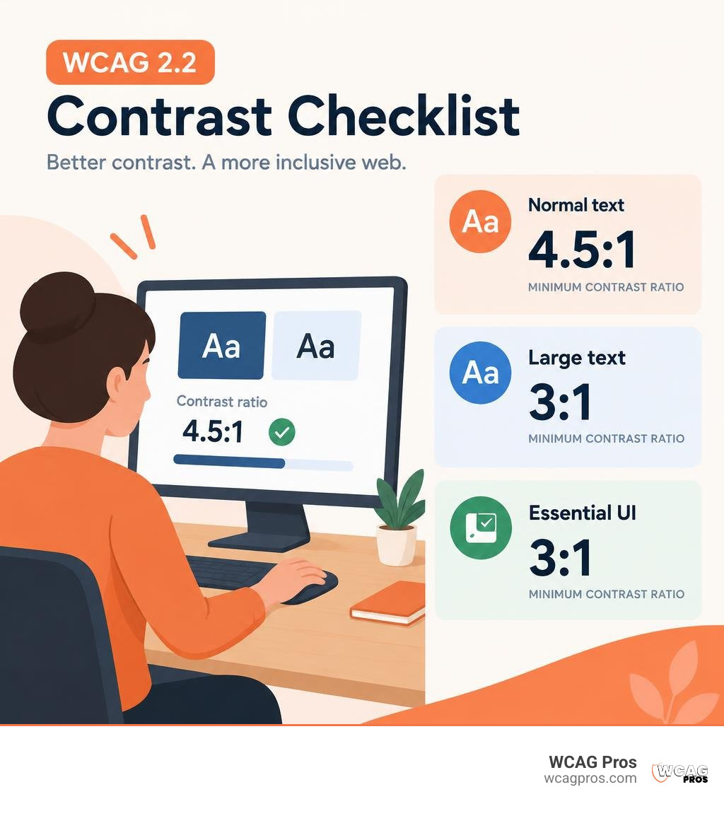
Basic check color accessibility terms:
Why You Must Check Color Accessibility for Modern Web Design
Color accessibility measures how easily human eyes can differentiate text and interface elements from their surrounding backgrounds. When digital creators build interfaces using low contrast, they unintentionally lock out millions of potential visitors. Digital accessibility is not an aesthetic compromise. It is a fundamental engineering requirement for usable software.
At the core of visual accessibility is relative luminance, which represents the perceived brightness of any given color space. Contrast ratios measure the difference in relative luminance between foreground and background elements. The scale ranges from 1:1, representing two identical colors with zero contrast, up to 21:1, which represents pure black placed directly against pure white.
Understanding how to test color contrast compliance protects your organization from legal liability while creating crisp, readable content. Meeting ADA standards and international digital criteria ensures that your products welcome every user, regardless of their visual acuity or environmental lighting conditions.
The Real Cost of Low-Contrast UI on User Experience
Low-contrast text remains the single most prevalent accessibility failure across the internet. In the WebAIM Million 2026 benchmark, automated scanners detected low-contrast text on 83.9% of top home pages, averaging 34 distinct contrast errors per page. That represents an increase from 79.1% in 2025, proving that modern design trends still lean heavily toward unreadable, muted aesthetics.
When users struggle to read light gray copy or faint button labels, they experience immediate visual fatigue. If reading your checkout flow feels like an eye exam, customers simply bounce to a competitor. Furthermore, real-world browsing rarely happens in perfectly dark testing labs. Outdoor sunlight, mobile screen glare, dimmed battery-saver displays, and cheap desktop monitors severely wash out delicate color palettes. Learning how to use a color contrast checker to save your design keeps your conversion rates high and your content effortlessly readable anywhere.
How Color Blindness and Low Vision Impact Visual Perception
Visual perception varies widely across your audience. Approximately 8% of men and 0.5% of women navigate the web with some form of color vision deficiency. Common conditions include:
- Deuteranopia, which reduces sensitivity to green light spectrums
- Protanopia, which limits the perception of red hues
- Tritanopia, which makes distinguishing blue and yellow tones difficult
- Monochromacy or total color blindness, where individuals perceive the world purely through shades of lightness and darkness
Beyond inherited color blindness, millions of people experience reduced visual acuity, cataracts, glaucoma, or the natural visual degradation that accompanies aging eyesight. People with these conditions cannot rely on hue separation alone to decipher your interface. Because human eyes process brightness through distinct luminance pathways, high luminance contrast ensures text remains sharp even when specific color wavelengths become invisible. Using color blindness simulation filters during your design reviews ensures your visual hierarchy remains intact for every visitor.
WCAG 2.2 Contrast Standards: AA vs. AAA Requirements
The World Wide Web Consortium outlines exact numerical targets within the WCAG 2.2 framework. To achieve basic legal and operational compliance, organizations must conform to Level AA standards. Organizations striving for optimal readability aim for Level AAA, which provides enhanced contrast for specialized audiences.
Review our guide to WCAG AA compliance requirements to see how Success Criterion 1.4.3 for text contrast and Success Criterion 1.4.11 for non-text elements fit into overall web standards.
| Element Type | WCAG 2.2 Level AA Minimum | WCAG 2.2 Level AAA Enhanced | Exceptions and Exclusions |
|---|---|---|---|
| Normal Body Text | 4.5:1 | 7:1 | Incidental text, brand logos, disabled controls |
| Large Text | 3:1 | 4.5:1 | Decorative copy with no informational value |
| User Interface Components | 3:1 | Not specified | Inactive inputs, default uncustomized browser borders |
| Informational Graphics | 3:1 | Not specified | Complex photos, illustrations without structural data |
Text Contrast Thresholds: Normal vs. Large Text
WCAG 2.2 establishes two distinct categories for readable text based on physical rendering size. Normal text, which includes most paragraph body copy, navigation menus, and form labels, requires a minimum contrast ratio of 4.5:1 for Level AA and 7:1 for Level AAA.
Large text receives a slightly relaxed threshold because thicker, larger letterforms are inherently easier for human retinas to resolve. Under WCAG definitions, large text is defined as:
- Text that is at least 18pt (24px) in regular font weight
- Text that is at least 14pt (approximately 18.66px) in bold font weight
Large text requires a 3:1 contrast ratio under Level AA and a 4.5:1 ratio under Level AAA. When reviewing typography systems, check out our comprehensive guide to WCAG 2.2 Level AA standards to ensure responsive scaling does not accidentally shrink a passing large heading into a failing normal text size on mobile screens.
Non-Text Contrast: Icons, Buttons, and Form Controls
Many teams assume contrast checks end with paragraph text, but WCAG 2.2 Success Criterion 1.4.11 mandates that essential graphical objects and user interface components achieve at least a 3:1 contrast ratio against their adjacent backgrounds.
This requirement applies directly to:
- Form input borders that allow users to identify where to click or tap
- Standalone navigation icons, such as search magnifying glasses or hamburger menus without accompanying text labels
- Active focus indicators and customized checkbox or radio button outlines
- Meaningful segments of data visualizations, including pie chart wedges and bar graph columns
If a user cannot perceive where an input box begins or cannot distinguish an unread notification icon from the navigation bar, the interface fails accessibility compliance. Learn to master WCAG color contrast compliance across every UI component to protect all interactive elements throughout your application.
Step-by-Step Guide: How to Check Color Accessibility Across Your Site
Evaluating your digital assets requires a balanced combination of automated scanning tools and targeted manual validation. By adopting an orderly evaluation sequence, your design and engineering teams can catch contrast failures long before code reaches production environments.
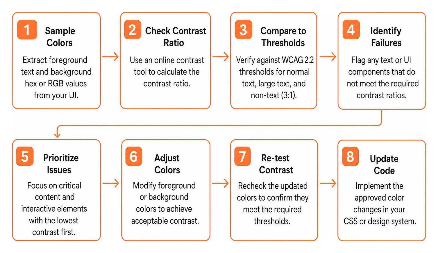
When establishing your internal testing process, utilize these proven contrast test website techniques to systematically audit each template layout.
How to Check Color Accessibility with Online Contrast Tools
Testing individual color pairings is simple when using dedicated web-based utilities. Start by extracting the exact hexadecimal or RGB values of your foreground text and its background container.
Popular testing tools include:
- The WebAIM Contrast Checker, which provides instant AA and AAA pass or fail indicators alongside an API for developers
- The Coolors Contrast Checker, which allows real-time lightness adjustments and convenient color blindness presets
- The Access Hue accessibility tool, which evaluates contrast across HEX, HSL, and OKLCH color spaces while exporting ready-to-use CSS variables and Tailwind configuration files
- Specialized checkers like the WCAG Color Contrast Checker for quick online ratio comparisons
Input your two hex values into the tool. If your body copy pairing scores below 4.5:1, adjust the lightness slider until the ratio crosses the compliant threshold. Next-generation tools are also beginning to incorporate the Advanced Perceptual Contrast Algorithm (APCA), which analyzes spatial frequency and font weight to model human visual perception even more closely.
How to Check Color Accessibility on Live Webpages and DevTools
While testing isolated swatches works well during initial mood board creation, testing live rendered code is essential for finding real-world failures.
To evaluate live pages quickly:
- Right-click any text element in Google Chrome, Brave, or Microsoft Edge and select Inspect.
- In the Styles pane, locate the
colorproperty and click the color swatch box. - Expand the Contrast ratio section in the color picker popup. DevTools displays the exact numerical ratio, green checkmarks for passing levels, and visual contrast lines directly on the color spectrum.
- Run full-page automated auditing engines such as the axe-core browser extension or Lighthouse to identify systemic issues across nested wrappers.
- Manually trigger dynamic states, including
:hover,:focus-visible, and:active, to ensure interactive color changes maintain the required 3:1 or 4.5:1 ratios against their background states.
Incorporate these checks into our ultimate website accessibility testing checklist for 2026 to ensure no dynamic component slips through unverified.
Fixing Complex Contrast Failures: Images, Gradients, and Brand Palettes
Finding low-contrast elements is straightforward, but fixing them without disrupting your visual identity requires thoughtful design solutions. Common offenders include faint placeholder text inside search inputs, light gray body copy like #999999 on white backgrounds, and text placed over busy hero graphics.
Tools like the Accessible Color Palette Checker & Contrast Matrix | Colors.to allow you to view an entire grid of brand color combinations at once, highlighting compliant pairings while proposing minimal lightness tweaks that preserve your core hue.
Readability Solutions for Text Over Background Images and Gradients
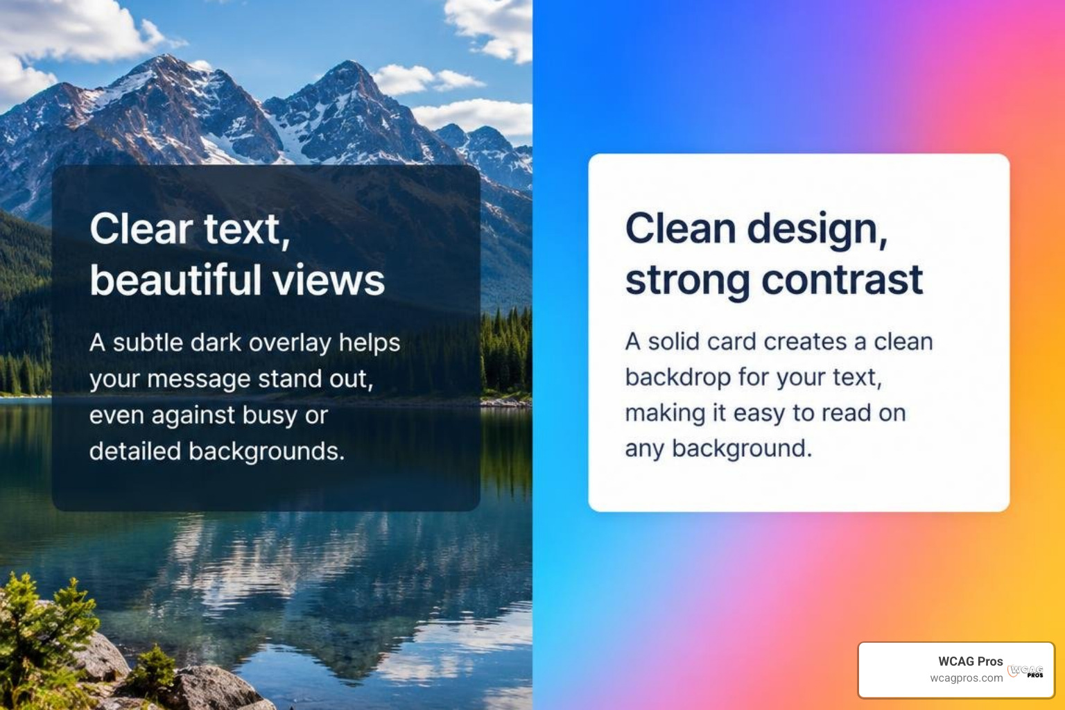
Placing text over photographs or multi-stop gradients frequently causes WCAG failures because background luminance shifts across the image. A white headline might pass over a dark shadow on the left side of a photo but become completely illegible when crossing over a bright highlight on the right.
To resolve text-over-image contrast issues:
- Add a semi-transparent dark or light overlay scrim beneath the text layer across the entire container
- Place text inside a solid or semi-opaque background card component
- Implement strong, non-blurry CSS drop shadows that create a consistent contrast buffer around letterforms
- Test contrast against both the lightest and darkest pixels directly behind the text layer
Adapting Inflexible Brand Colors Without Losing Identity
Marketing teams often worry that accessibility requirements will destroy their brand identity. In reality, you can easily preserve brand recognition by creating accessible digital variants.
Use the Free Brand Color Contrast & Accessibility Checker: Contrast to sweep your brand kit and identify safe pairings. If your signature corporate yellow fails on white backgrounds, reserve that vibrant yellow for decorative accents, dark container backgrounds, or thick graphical borders. For body copy and interactive links, generate a deeper, darkened tone of your primary hue using the Colour Picker | Accessible Palette Generator. This tool adjusts lightness while preserving your exact brand hue angle, achieving flawless Level AA or AAA compliance.
Moving Beyond Color Alone (WCAG SC 1.4.1)
Contrast ratios solve luminance challenges, but WCAG Success Criterion 1.4.1 mandates that color must never serve as the sole visual means of conveying information, indicating an action, or prompting a response. If a user with total color blindness navigates your site, removing all color saturation must leave every instruction and status perfectly understandable.
Essential non-color visual indicators include:
- Persistent text underlines for inline hyperlinked text within paragraphs
- Distinct glyph icons alongside red error messages and green success notifications
- Pattern fills, diagonal stripes, or direct text labels on charts rather than relying exclusively on a colored legend
- Bold typographic weights and shape borders for selected navigation tabs
Frequently Asked Questions About Color Contrast Compliance
What is the easiest way to test website color contrast compliance?
The easiest way to perform spot tests is using your browser built-in developer tools or dedicated browser extensions. Inspecting an element directly in your browser provides real-time calculated ratios that account for rendered font sizes and CSS inheritance. For site-wide evaluations, automated accessibility scanners quickly identify obvious background and foreground failures across hundreds of URLs simultaneously.
Does passing contrast checks make a website fully ADA compliant?
No. While color contrast is one of the most visible accessibility criteria, it represents only a small portion of complete WCAG 2.2 Level AA conformance. An accessible digital experience also requires full keyboard navigation support, logical focus order, descriptive alternative text for images, properly structured headings, accessible form labels, and compatibility with modern screen readers.
What hex color codes guarantee accessible text on white backgrounds?
On a pure white background (#FFFFFF), regular body text must have a luminance value resulting in at least a 4.5:1 ratio. Safe, compliant options include:
- Pure black (
#000000), yielding the maximum 21:1 contrast ratio - Dark charcoal gray (
#595959or darker, such as#2D3748), easily meeting 4.5:1 - Accessible dark blue (
#0000EEor#1E40AF), providing strong brand color with full compliance
Any gray lighter than #767676 will fail Level AA requirements for normal text on white surfaces.
Conclusion
Creating an accessible digital experience does not mean abandoning creative design. By establishing accessible color palettes early in your design system and regularly testing components across every interactive state, you build digital products that are cleaner, more readable, and welcoming to all audiences.
Proactive palette testing prevents expensive code refactoring after launch and safeguards your business against legal exposure. When you are ready to ensure comprehensive ADA and WCAG compliance across your entire digital presence, partner with our team at WCAG Pros for a comprehensive WCAG audit. We provide complete page-by-page audits across all 54 WCAG criteria, complete with exact code fixes and free re-audits to help you achieve verified compliance badges with confidence.
Read more website accessibility articles
Get Help With Your Website
We'll follow up with info about:
- The process
- Cost
- Timeline
We promise to respect your privacy, and never abuse the information you provide. We will not sell or rent your information to any third party.
By submitting this form, you consent to receive SMS messages and/or emails from SEM Dynamics LLC, dba WCAG Pros. To unsubscribe, follow the instructions provided in our communications. Msg & data rates may apply for SMS. Your information is secure and will not be sold to third parties.