
Master WCAG Color Contrast Compliance Across Every UI Component
Master WCAG Color Contrast Compliance Across Every UI Component
Start Every WCAG Color Contrast Check With the Right Threshold
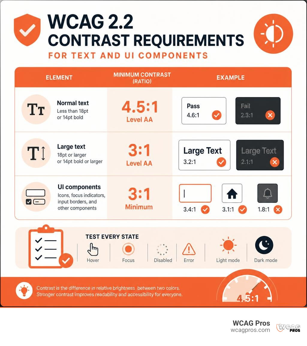
Run a WCAG color contrast check by testing each foreground and background color pair in a contrast checker, then compare the result with the WCAG 2.2 threshold that applies:
- Normal text: at least 4.5:1 for Level AA.
- Large text: at least 3:1 for Level AA.
- Meaningful icons, focus indicators, input borders, and other UI components: at least 3:1.
- Test every state, including hover, focus, disabled, error, light mode, and dark mode.
Contrast is the difference in relative brightness between two colors. It helps people with low vision read content, understand controls, and complete forms. It also matters for people with color vision deficiencies, which affect about 1 in 12 men and 1 in 200 women.
Low contrast text remains one of the most common web accessibility failures. A passing color pair is not full WCAG compliance, but it is a vital first step toward a website that is easier to use and less exposed to ADA related accessibility risk.
I am Matthew Post, cofounder of WCAG Pros and a web development professional with more than 20 years of experience. I oversee accessibility audits and remediation work, including detailed WCAG color contrast check reviews across real world websites and UI systems.
Easy WCAG color contrast check glossary:
Related resources include an ADA audit checklist, guidance from a website accessibility remediation company, and an explanation of what an ADA compliant website is.
Understanding WCAG 2.2 Contrast Ratios and Relative Luminance Formulas
Digital accessibility relies on mathematical relationships between light and dark rather than subjective visual impressions. Over 2.2 billion people globally live with some form of vision impairment. When digital interfaces rely on subtle, low contrast color palettes, critical content becomes invisible to millions of daily users. The WebAIM Million report consistently reveals that low contrast text is the single most common accessibility barrier on the web, appearing on more than 80% of tested homepages.
Under WCAG 2.2, contrast requirements are separated into distinct conformance levels based on text size, weight, and component function. Level AA represents the standard legal baseline for most organizations, while Level AAA establishes enhanced legibility standards for reading heavy environments.
For broader structural context, see the ultimate guide to WCAG guidelines.
WCAG 2.2 contrast thresholds include:
- Normal body text: under 18pt regular, which is 24px, or under 14pt bold, which is 18.66px. Level AA requires 4.5:1. Level AAA requires 7:1.
- Large text: at least 18pt regular, which is 24px, or at least 14pt bold, which is 18.66px. Level AA requires 3:1. Level AAA requires 4.5:1.
- UI component boundaries: active input borders, toggle outlines, and button edges. Level AA requires 3:1. Level AAA is not applicable.
- Meaningful icons and graphics: standalone glyphs, chart data points, and info icons. Level AA requires 3:1. Level AAA is not applicable.
- Focus indicators: keyboard navigation rings and bounding visual cues. Level AA requires 3:1. Level AAA is not applicable.
Calculating Luminance with the (L1 + 0.05) / (L2 + 0.05) Formula
The numerical contrast ratio is derived from the relative luminance of two colors. Relative luminance measures the perceived brightness of any point in the sRGB color space, normalized from 0 for the darkest black to 1 for the brightest white.
The mathematical formula is:
(L1 + 0.05) / (L2 + 0.05)
In this equation, L1 represents the relative luminance of the lighter color, and L2 represents the relative luminance of the darker color. The constant addition of 0.05 represents an offset for ambient screen flare and prevents division by zero.
To determine L1 and L2, each red, green, and blue channel must be linearized to undo gamma correction before calculating the weighted sum of spectral perception. Because the human eye is far more sensitive to green light than red or blue, green is weighted at roughly 71.5%, red at 21.3%, and blue at just 7.2%.
This equation produces a dynamic scale from 1:1, representing identical colors with zero contrast, up to 21:1, representing pure black (#000000) against pure white (#FFFFFF). You can verify any custom color pairing quickly using the WebAIM Contrast Checker.
WCAG 2.2 vs. APCA in WCAG 3
While WCAG 2.2 remains the official international standard referenced by regulatory bodies, the upcoming WCAG 3 draft introduces the Accessible Perceptual Contrast Algorithm (APCA).
The legacy WCAG 2.2 formula is symmetric, meaning it calculates the exact same ratio whether a color is used as the foreground text or the background container. However, human vision does not perceive contrast symmetrically. Dark text on a light background interacts differently with the human eye than light text on a dark background due to spatial frequency and optical halation.
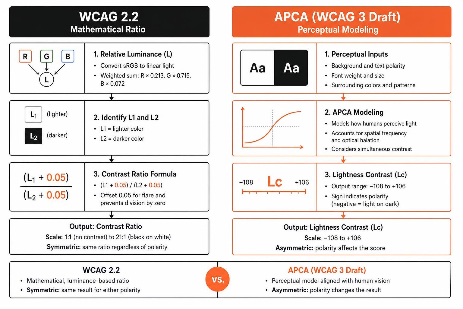
APCA addresses these physiological nuances by generating a Lightness Contrast (Lc) score ranging from negative 108 to positive 106. APCA evaluates:
- Background and text polarity, including dark mode versus light mode
- Exact font weights and physical rendering sizes
- Simultaneous contrast effects across adjacent surfaces
For modern design systems preparing for the future, tools like the ColorUI Contrast Checker offer simultaneous validation for both WCAG 2.2 ratios and APCA Lc values.
How to Perform a WCAG Color Contrast Check Step by Step
Evaluating color contrast is an essential part of the design and development lifecycle. Relying on visual intuition often leads to interfaces that do not comply because computer monitors render colors with varying gamma curves, color spaces, and brightness levels.
To establish an ironclad evaluation workflow, explore color contrast compliance testing across complex interactive layouts.

Follow this step by step process during your audit:
- Identify the exact hex, RGB, or HSL color values for both the foreground text or icon and its immediate background surface.
- If alpha transparency is used, calculate the blended opaque color resulting from the foreground and background composite.
- Input the values into a validated contrast checker tool to determine the exact ratio.
- Verify the font size and font weight rendered in the browser to establish whether the 4.5:1 or 3:1 threshold applies.
- Test the component again across all dynamic states, including default, hover, focus, active, disabled, and error.
- Switch the interface into dark mode and test the inverted tokens independently.
Setting Up Your Tool for a WCAG Color Contrast Check
To streamline testing, configure browser developer tools alongside dedicated contrast calculation utilities. In Google Chrome, Firefox, and Safari, the built in element inspector provides an integrated color picker that displays real time WCAG AA and AAA pass or fail indicators directly within the CSS style rules.
For design teams working in Figma or Sketch, automated token inspection plugins allow you to check entire design system component libraries simultaneously. Learn how to use a color contrast checker before writing front end code.
When working with interactive applications, browser based inspection tools help catch dynamic pseudo classes and CSS custom properties that static design files might overlook.
Testing UI Components, Icons, and Form States
WCAG 2.2 Success Criterion 1.4.11 mandates at least a 3:1 contrast ratio for visual information required to identify user interface components and graphical objects. This criterion is frequently violated in modern minimalist interfaces.
You must ensure 3:1 contrast for:
- Input field borders against the surrounding page background so users can identify the clickable form area
- Checkbox, radio button, and custom toggle boundaries in both selected and unselected states
- Meaningful standalone icons, such as magnifying glasses for search or shopping carts, that lack accompanying text labels
- Visible keyboard focus indicators, ensuring the focus ring clearly contrasts against both the component and the adjacent background
- Chart legends, data slices, and graph lines in analytical dashboards
Placeholder text inside input fields is another frequent trap. While WCAG does not strictly classify placeholder text as a UI component boundary, it functions as body copy when instructing users. If placeholder text is critical for understanding what to input, it must meet the standard 4.5:1 text requirement.
Remediating Low Contrast Without Breaking Your Brand Identity
Designers often worry that strict accessibility compliance will ruin their carefully crafted brand color palette. Fortunately, achieving full compliance rarely requires abandoning your core brand identity. In most cases, making minor perceptual lightness adjustments is all it takes.
Review these contrast testing strategies to enhance visual hierarchy while maintaining aesthetic appeal.

When a brand color fails contrast requirements, apply these practical adjustments:
- Shift the lightness value while keeping the exact hue and saturation intact. Moving a color just 5% darker or lighter often moves it over the 4.5:1 threshold without altering the perceived color family.
- Reserve vibrant, low contrast brand colors for decorative illustrations, large hero banners, or nonessential visual accents where contrast rules do not apply.
- Create a dedicated accessible digital palette variant. Many global brands use a slightly deeper shade of their signature color for digital typography while keeping the primary shade for print and logo marks.
- Leverage high contrast dark neutral surfaces to allow lighter brand accents to pass comfortably at 3:1 or 4.5:1.
Solving Complex Contrast on Gradients, Overlays, and Hero Images
Text placed over background photography, video loops, and complex CSS gradients presents a unique accessibility challenge. Because photographic backgrounds contain varied pixel brightness, text might pass over one area of the image while failing completely over another.
To guarantee compliance over dynamic imagery:
- Sample both the lightest and the darkest pixels directly behind the text bounding box. The text must pass contrast requirements against the worst case pixel area.
- Place a semi transparent dark or light overlay scrim between the background image and the text layer to normalize background luminance.
- Apply a solid or tinted backing container behind text elements, transforming the immediate background into a predictable, testable surface.
- Utilize multilayered CSS text shadows with zero blur radius to create a sharp, high contrast barrier around letterforms.
- Implement responsive CSS breakpoints that drop the photographic background entirely on smaller mobile screens, placing text on a solid surface.
Common Color Combinations That Pass or Fail
Understanding how common digital color pairings perform mathematically helps design teams avoid obvious accessibility pitfalls early:
- Pure Black (
#000000) on Pure White (#FFFFFF): Passes all levels with a perfect 21:1 ratio. - Navy Blue (
#0A2540) on White (#FFFFFF): Passes Level AAA for normal text with a strong 13.8:1 ratio. - Standard Link Blue (
#0000EE) on White (#FFFFFF): Passes Level AA for normal text with a 6.1:1 ratio. - Midtone Gray (
#767676) on White (#FFFFFF): Passes Level AA with a 4.54:1 ratio, but fails Level AAA. - Light Gray (
#999999) on White (#FFFFFF): Fails Level AA normal text completely with a 2.84:1 ratio. - Vivid Lime Green (
#00FF00) on White (#FFFFFF): Fails severely with an illegible 1.37:1 ratio. - Vivid Yellow (
#FFD700) on White (#FFFFFF): Fails Level AA normal text with a 1.45:1 ratio, but easily passes against Black (#000000) with a 14.4:1 ratio. - Corporate Cyan (
#00A3E0) on White (#FFFFFF): Fails Level AA for normal text at 2.4:1, requiring significant darkening to#00628Ato pass at 4.6:1.
Legal Risks and Regulatory Standards for Contrast Noncompliance
Color contrast is not just a visual design guideline. It is a strict legal requirement across global digital accessibility laws. In the United States, Title III of the Americans with Disabilities Act (ADA) requires places of public accommodation, including commercial websites and applications, to be accessible to individuals with disabilities. Federal courts routinely reference WCAG standards as the benchmark for ADA compliance.
In 2023 alone, over 4,000 digital accessibility lawsuits were filed in US federal courts, representing a dramatic increase from approximately 800 filings in 2017. A significant percentage of these lawsuits and private demand letters cite low contrast text and invisible interactive form fields as core complaints.
For public sector entities and federal contractors, Section 508 of the Rehabilitation Act formally mandates WCAG Level AA conformance. Internationally, the European Accessibility Act (EAA) enforces WCAG compliance across commercial digital products, ecommerce platforms, and banking services operating within the European Union under standard EN 301 549.
To safeguard your organization against litigation, implement an ADA compliance website checklist and align your development processes with our WCAG accessibility checklist.
Why Automated Tools Miss Context During a WCAG Color Contrast Check
While automated accessibility crawlers are valuable for rapid scanning, they cannot replace thorough manual audits. Automated engines frequently produce both false positives and false negatives due to CSS complexity.
Automated scanners struggle when:
- Text is positioned over multicolored CSS gradients or background images with dynamic lighting
- Background colors are rendered via complex CSS pseudo elements like
::beforeor::after - Color values change dynamically during hover, focus, or custom JavaScript canvas animations
- Translucent elements utilize nested CSS opacity or CSS background blur filters
- Elements are visually hidden off screen but remain present in the DOM
A comprehensive accessibility audit requires human verification to evaluate every component in its true rendered visual context.
Frequently Asked Questions About WCAG Color Contrast
What is the minimum color contrast ratio required for Level AA compliance?
Under WCAG 2.2 Level AA, standard body text smaller than 18pt regular (24px) or smaller than 14pt bold (18.66px) requires a minimum contrast ratio of 4.5:1 against its background. Large text, defined as at least 18pt regular or at least 14pt bold, requires a minimum ratio of 3:1. Visual user interface components, such as form input borders, active focus rings, and essential standalone icons, must also maintain at least a 3:1 contrast ratio against adjacent surfaces.
Are logos and brand wordmarks required to pass contrast checks?
No. Text that is part of a brand logo or wordmark is explicitly exempt from WCAG contrast requirements under Success Criterion 1.4.3 and 1.4.11. Incidental text that is part of a background photograph containing other visual elements, as well as purely decorative nonfunctional graphics, are also exempt. However, any surrounding interface text, such as navigation links, headers, or call to action buttons near the logo, must fully comply with contrast thresholds.
How does dark mode impact color contrast compliance?
Dark mode layouts must be evaluated as an entirely separate color system rather than a direct algorithmic color inversion. When designing for dark surfaces, high contrast pure white text on pitch black backgrounds can cause halation, where text appears to glow or blur for users with astigmatism. Designers should use off white text (such as #E0E0E0) on deep dark gray surfaces (such as #121212), which comfortably exceeds the 4.5:1 Level AA requirement while improving overall reading comfort.
Conclusion
Creating an accessible digital experience requires proactive color choices across every layer of your design system. By establishing compliant color tokens in your design libraries, embedding automated linting into continuous CI/CD development pipelines, and performing regular manual checks on interactive components, your team can deliver an inclusive experience that satisfies both WCAG 2.2 standards and legal accessibility mandates.
At WCAG Pros, we specialize in comprehensive page by page accessibility audits across all 54 WCAG points. We provide precise code level remediation guidance and free follow up audits with official compliance badges to ensure your website remains fully protected.
Ensure your entire digital experience is fully accessible by choosing to schedule a professional WCAG audit with our team today.
Read more website accessibility articles
Get Help With Your Website
We'll follow up with info about:
- The process
- Cost
- Timeline
We promise to respect your privacy, and never abuse the information you provide. We will not sell or rent your information to any third party.
By submitting this form, you consent to receive SMS messages and/or emails from SEM Dynamics LLC, dba WCAG Pros. To unsubscribe, follow the instructions provided in our communications. Msg & data rates may apply for SMS. Your information is secure and will not be sold to third parties.