
Audit Web Accessibility Easily With the Best Color Contrast Checker
Find the Best Color Contrast Checker for Your Website
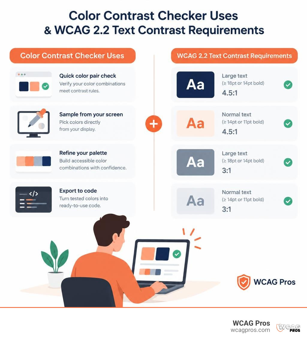
The best color contrast checker depends on what you need to test. Use WebAIM for a quick color pair check, TPGi Colour Contrast Analyser to sample colors from your screen, and Coolors to refine a palette. Access Hue is useful when you need to export tested colors into code.
These tools help you check whether text and interface elements meet WCAG 2.2 contrast rules. They do not replace a full website audit, especially when text sits over images or colors change on hover.
I’m Matthew Post, co-founder of WCAG Pros, with more than 20 years of web development experience and a focus on accessibility audits and fixes. I’ll use that experience to help you choose the best color contrast checker for your workflow.
Best color contrast checker word list:
Understanding WCAG 2.2 Color Contrast Requirements
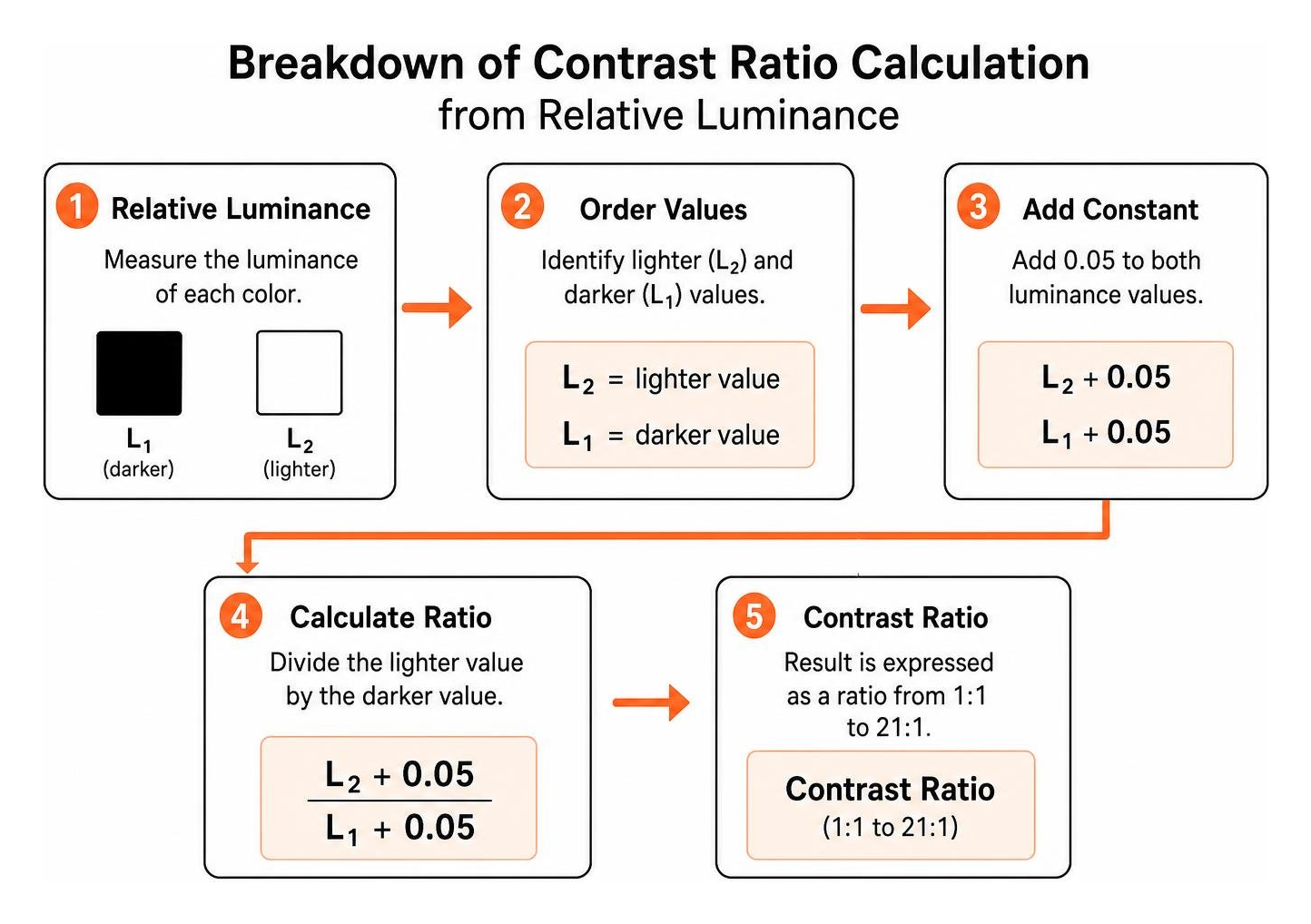
Color contrast measures the difference in relative luminance between two colors, expressed as a ratio from 1:1 for identical shades up to 21:1 for pure black against pure white. Digital accessibility relies on sufficient contrast so that text and interface controls remain perceivable for everyone, including over 200 million people worldwide living with visual impairments such as low vision or color blindness.
Under the Web Content Accessibility Guidelines, contrast success criteria ensure that users can read body copy, scan headings, and navigate active elements without straining. When building digital products, teams must align their palettes with Level AA requirements as a legal baseline, while striving for Level AAA where enhanced clarity is needed. If you want to master WCAG color contrast compliance across every UI component, you need to understand how the standard evaluates relative luminance and foreground-to-background balance. You can also explore foundational design principles through the guide on Color and Color Contrast to see how luminance values operate in everyday layouts.
Text, Icons, and Interface Contrast Thresholds
WCAG 2.2 establishes clear mathematical thresholds based on font size, weight, and component type:
- Normal Text (Level AA): Requires a minimum contrast ratio of 4.5:1. This applies to all body copy, standard links, table content, and form field text below 18 points (approximately 24px) or below 14 points bold (approximately 18.66px bold).
- Large Text (Level AA): Requires a minimum contrast ratio of 3:1. Large text is defined specifically as text that is at least 18 points regular or at least 14 points bold.
- Normal Text (Level AAA): Requires an enhanced contrast ratio of at least 7:1 for standard body copy.
- Large Text (Level AAA): Requires a minimum contrast ratio of 4.5:1 for large typography.
- Non-Text Elements (Level AA): User interface components, including form input borders, checkboxes, radio buttons, navigation icons, and graphical objects in charts, require at least a 3:1 contrast ratio against their adjacent backgrounds.
Meeting these thresholds prevents digital fatigue and makes interfaces accessible on mobile screens under direct sunlight. To audit your interface colors effectively, stop squinting and fix your digital palette for good by calculating ratios for interactive states such as hover, focus, and active triggers.
Exemptions to WCAG Contrast Guidelines
Not every graphic on a website must satisfy strict numeric ratios. WCAG 2.2 outlines specific exceptions where contrast requirements do not apply:
- Logotypes and Brand Names: Text that is part of a logo or specific brand name has no contrast requirement.
- Incidental and Decorative Text: Text or graphics that serve purely decorative functions, provide no vital information, and are invisible to assistive technologies are exempt.
- Inactive Controls: Disabled buttons, grayed-out menu items, or inactive input fields do not need to meet standard contrast ratios, although keeping them legible is good user experience practice.
- Text in Photographs: Text that is part of a natural photographic scene (such as a street sign in a background photo) where the text is not conveying crucial web content is exempt.
- Heatmaps and Continuous Spectrum Graphics: Complex data visualizations where color represents a continuous range rather than discrete interactive states are exempt from strict discrete ratios.
For an in-depth breakdown of these criteria and exceptions, review our comprehensive guide to WCAG 2.2 Level AA standards to ensure you apply exemptions accurately.
The Best Color Contrast Checker Tools Compared
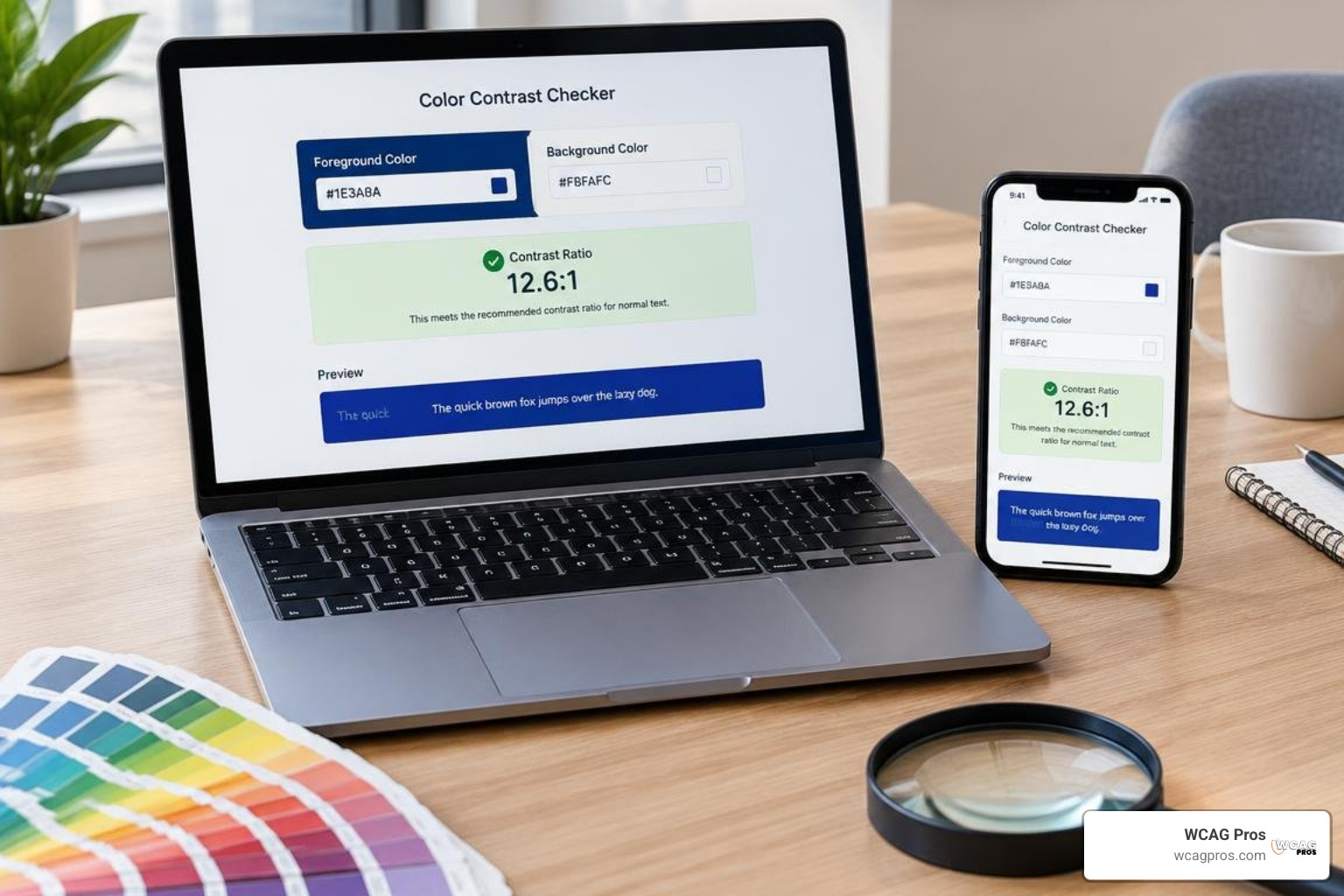
Choosing the best color contrast checker depends on your role, software environment, and testing methodology. Some tools excel at single-pair HEX testing during initial moodboarding, while others let developers sample rendered pixels directly across operating system windows. For a broader overview of the testing ecosystem, consult our web accessibility testing tools guide 2026.
| Tool Name | Best For | Platform | Key Features | Export Capabilities |
|---|---|---|---|---|
| WebAIM Contrast Checker | Quick Browser Checks | Web-based | Lightness sliders, live pass/fail, API support | URL parameters, JSON via API |
| TPGi Colour Contrast Analyser | Native Apps & Documents | Windows, macOS | Desktop eyedropper, color blindness simulation | HEX, RGB, direct clipboard |
| Coolors Contrast Checker | Creative Design Work | Web-based | Auto-adjust suggestions, palette synchronization | Palette export, URL sharing |
| Adobe Color Analyzer | Brand Design Systems | Web-based | Harmony generation, color-blind conflict mapping | Adobe Creative Cloud libraries |
| Access Hue | Developer Integration | Web-based | Real-time code tokens, contrast matrix | Tailwind config, CSS variables, JSON |
WebAIM Contrast Checker as the Best Color Contrast Checker for Fast Browser Audits
The Contrast Checker by WebAIM remains an industry standard for rapid evaluation. It provides straightforward text boxes for foreground and background HEX codes, accompanied by interactive lightness sliders that let you adjust shades in real time until they meet Level AA and Level AAA standards. WebAIM also provides a programmable API endpoint that returns JSON data, making it easy to run automated checks within custom testing scripts. If you use on-page scanning tools, you will recognize its core engine inside the WAVE extension, which we cover in our WAVE tool accessibility complete guide.
TPGi Colour Contrast Analyser as the Best Color Contrast Checker for Desktop Applications
When auditing software interfaces, native PDF files, or complex vector mockups, the TPGi Colour Contrast Analyser stands out as the best color contrast checker for operating-system-level inspection. You can learn more about its heritage through the resources on Colour accessibility tools and resources. Unlike purely web-based checkers, TPGi CCA installs on macOS and Windows, offering a dual-eyedropper utility that magnifies and samples any pixel on your screen. It evaluates text and non-text graphical elements against WCAG 2.2 ratios while providing real-time simulations for deuteranopia, protanopia, and tritanopia.
Coolors Contrast Checker for Creative Palette Generation
The Color Contrast Checker from Coolors bridges the gap between aesthetic palette creation and strict accessibility conformance. Designers can enter two colors, review immediate pass or fail scores for normal and large text, and press a single button to auto-adjust lightness until compliance is reached. Its tight integration with the broader Coolors palette generator allows creative teams to explore accessible color harmonies without leaving their creative workflow.
Adobe Color Contrast Analyzer for Design Systems
The Color Contrast Checker (AA/AAA) within Adobe Express and Adobe Color helps design teams build accessible design systems from the ground up. The tool allows you to select base brand hues and apply color harmony rules, such as complementary or triadic arrangements, while continuously evaluating contrast against WCAG guidelines. It flags potential color-blind conflicts across palette swatches, enabling designers to save accessible swatches directly to shared team libraries.
Access Hue for Multi-Format Code Export
For frontend developers building scalable UI component libraries, Access Hue: Accessibility Color Tool provides instant code integration. Beyond calculating contrast ratios across foreground and background pairs, it provides copy-ready code blocks formatted as CSS custom properties, JSON tokens, and Tailwind configuration objects. This eliminates manual color translation errors and ensures that accessible tokens move directly into production stylesheets.
How to Test and Fix Complex Color Combinations
Evaluating color contrast is straightforward when dealing with plain text on a solid background, but real-world web pages often use layered compositions, photography, and subtle gradients. Understanding how to test color contrast compliance requires testing the exact points where text intersects its lowest-contrast background area.

When testing live websites, you will encounter two primary approaches: single-pair testing and full-page scanning. Single-pair testing evaluates two specific color values, making it ideal during the design mockup stage. Full-page scanners analyze an entire live DOM tree to flag contrast errors across hundreds of elements at once. Knowing how to use a color contrast checker to save your design allows you to catch contrast defects before they become costly engineering rework.
Testing Text Over Images and Gradients
Placing white or light text over photographic hero banners frequently creates accessibility barriers because image brightness shifts across different viewports and responsive screen sizes. To ensure compliance:
- Sample Worst-Case Points: Use an eyedropper tool to measure the contrast ratio between your text color and the lightest pixel directly behind the letters when using white text, or the darkest pixel when using dark text.
- Apply Solid or Tinted Overlays: Place a semi-transparent dark or light overlay behind the text layer. An overlay with 40% to 60% opacity stabilizes the background luminance, ensuring the text consistently passes WCAG AA requirements regardless of screen scaling.
- Use Protective Text Containers: Wrap heading copy inside a solid or frosted background card with an explicit background color definition in CSS.
- Evaluate Gradients at Both Terminals: When text spans a linear or radial gradient, test the contrast ratio at both the start and end points of the gradient to verify that all letters meet the required 4.5:1 threshold.
You can verify that your dynamic layouts remain accessible by exploring techniques for a contrast test website making your content pop for everyone.
Practical Fixes for Failing Palette Combinations
When an existing brand palette fails accessibility tests, you do not need to abandon your visual identity. Small adjustments to relative luminance can resolve compliance failures:
- Darken Foreground Text: If a medium blue button text (#3498DB) fails on a light background with a 3.2:1 ratio, deepening the shade to navy (#1B4F72) lifts the ratio above 7:1, achieving AAA compliance while retaining the brand hue.
- Lighten Container Backgrounds: For dark mode designs where light gray text (#AAAAAA) on an off-black card (#222222) fails, brightening the text to #E0E0E0 or darkening the card background resolves the issue.
- Increase Typography Weight and Size: If a primary brand color achieves a 3.4:1 ratio against white, increasing the font size to 18 points (24px) or 14 points bold (18.66px bold) transitions the requirement from normal text (4.5:1) to large text (3:1), turning a failing element into a passing one.
- Add Structural UI Borders: When form fields or toggle switches blend into background cards, adding a 1px solid border with a 3:1 contrast ratio against the background guarantees full non-text compliance.
To ensure your team uses the right testing methodologies for these remediations, pick the best web accessibility evaluation tool for your team.
Integrating Contrast Testing into Design and Development Workflows
Building accessible digital experiences requires integrating contrast checks early in the design and development lifecycle. Relying on post-launch audits often leads to expensive redesigns and increases exposure to ADA compliance lawsuits. Over recent years, digital accessibility litigation in US federal courts has seen significant increases, making proactive testing a business necessity.
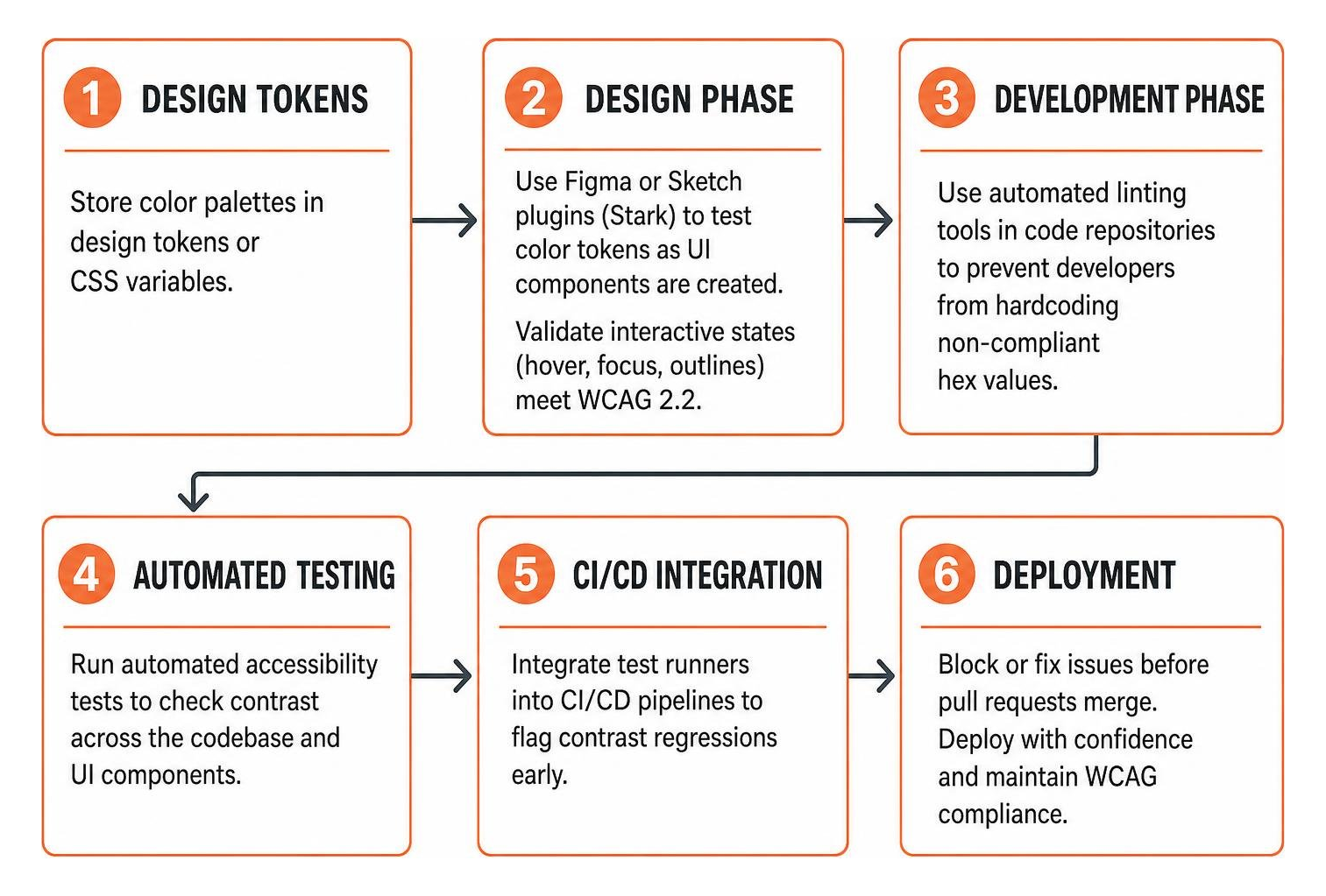
To establish an efficient accessibility workflow:
- Design Phase: Implement Figma or Sketch plugins such as Stark to test color tokens as UI components are created. Validate that all interactive states, including hover and focused outlines, satisfy WCAG 2.2 rules before engineering handoff.
- Development Phase: Store color palettes in centralized design tokens or CSS variables. Use automated linting tools in code repositories to prevent developers from hardcoding non-compliant hex values.
- Continuous Integration (CI/CD): Integrate automated accessibility test runners into your deployment pipelines to flag contrast regressions before pull requests merge into production.
- Manual Verification: Complement automated pipelines with regular manual sampling using tools like the TPGi CCA to inspect complex states, modals, and third-party widgets.
For a comprehensive view of accessibility governance across your organization, review the definitive guide to WCAG guidelines and implement our structured WCAG accessibility checklist guide.
Frequently Asked Questions About Color Contrast Checkers
What is the minimum color contrast ratio required for WCAG compliance?
Under WCAG 2.2 Level AA conformance, regular body text requires a minimum contrast ratio of 4.5:1 against its background. Large text (defined as 18 points or 14 points bold) requires at least a 3:1 ratio. User interface components, such as form input outlines, check boxes, and meaningful graphic icons, must also achieve a minimum ratio of 3:1. Level AAA conformance raises these requirements to 7:1 for normal text and 4.5:1 for large text.
How do I check color contrast for text placed over background photos?
To test text over photographic backgrounds, use a desktop eyedropper tool to sample the lowest-contrast section of the image directly behind the text. If your text is light, test against the brightest pixel of the photo behind the lettering. If your text is dark, test against the darkest pixel. If the resulting ratio fails the 4.5:1 requirement, apply a semi-transparent dark or light overlay behind the text, or place the copy inside a solid card container.
Are company logos required to meet WCAG contrast guidelines?
No. WCAG 2.2 explicitly exempts text that is part of a brand logo or registered trademark from color contrast requirements. Decorative visuals, inactive or disabled form buttons, and incidental background text are also exempt from numeric contrast thresholds.
Conclusion
Finding and using the right color contrast tools is an essential step toward digital accessibility, but automated tools alone cannot catch every barrier on a complex website. Dynamic interactions, multi-layered layouts, responsive image scaling, and assistive technology behaviors require thorough, hands-on review.
At WCAG Pros, we provide ADA website compliance consulting, delivering comprehensive page-by-page audits covering all 54 WCAG A and AAA criteria. Our team delivers exact code fixes and free re-audits to ensure your site earns full compliance certification. To discover more testing resources for your team, explore the ultimate list of free online accessibility checkers and take confident steps toward a fully accessible web.
Read more website accessibility articles
Get Help With Your Website
We'll follow up with info about:
- The process
- Cost
- Timeline
We promise to respect your privacy, and never abuse the information you provide. We will not sell or rent your information to any third party.
By submitting this form, you consent to receive SMS messages and/or emails from SEM Dynamics LLC, dba WCAG Pros. To unsubscribe, follow the instructions provided in our communications. Msg & data rates may apply for SMS. Your information is secure and will not be sold to third parties.